Calculating Your Color Options
Take Advantage of Colorful Possibilities
Experimenting with different pigments is a great way to discover new color mixtures and to explore all the ways you can play with your paints. In this fun exercise, accomplished artist Chris Cozen explains how to do just that: Focus on your colors. Keep notes on if any particular hues have made a strong presence and, possibly more importantly, how you feel about them.
And if Chris’s exercise give you color fever, your next resource for great guidance is Color Theory Made Really Easy: Masters’ Secret Formulas for Eye Popping Color — a home study course that you can take at your own pace with fantastic, colorful results!
How to Add 154 Different Colors to Your Acrylic Arsenal
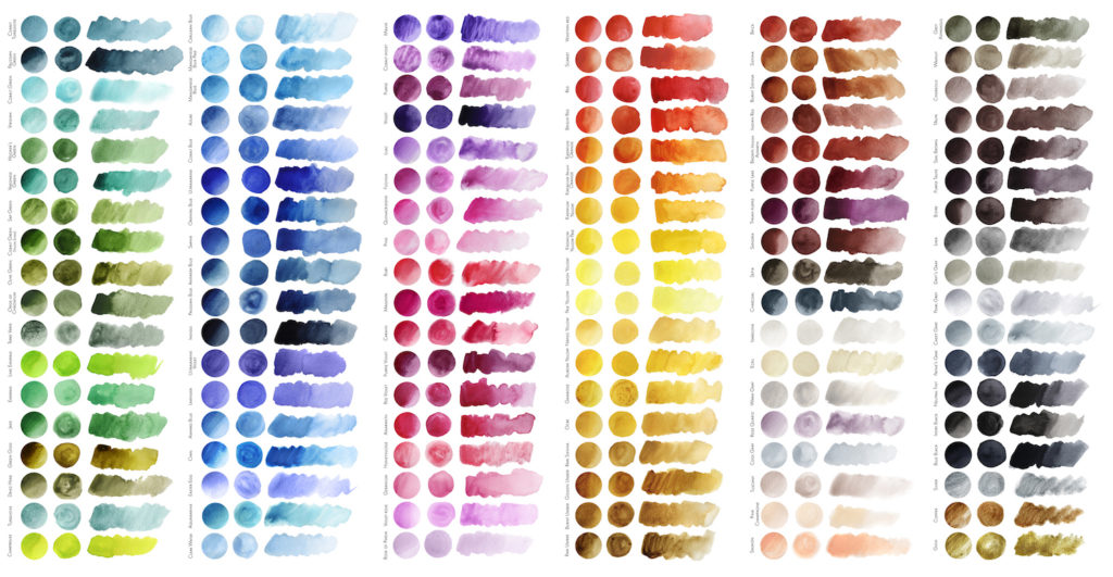
Think of all the paint mistakes we have made over the years. Remember all the mud you made as you attempted to mix up the perfect shade of purple or orange? What if someone told you that you could buy only eight colors of paint that would magically transform themselves into more than 150 colors? Well, you can do just that.
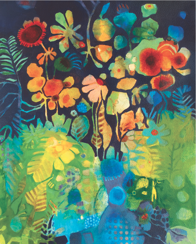
Making a few wise pigment choices can lead to an expansive collection in no time at all. Let me tell you how. The key is to choose pigments that play well together and are clean mixers. For this, we’ll use “modern” pigments, which come from chemistry labs. These pigments are known for their ability to allow light to pass through them, almost like colored glass.
Materials:
- Fluid acrylics (I use Golden Artist Colors®)
- Quinacridone red
- Anthraquinone blue
- Hansa yellow (medium)
- Interference violet
- Iridescent gold (deep)
- Micaceous iron oxide
- Titanium white
- Bone or carbon black
- Paintbrush, synthetic
1. Primary Power
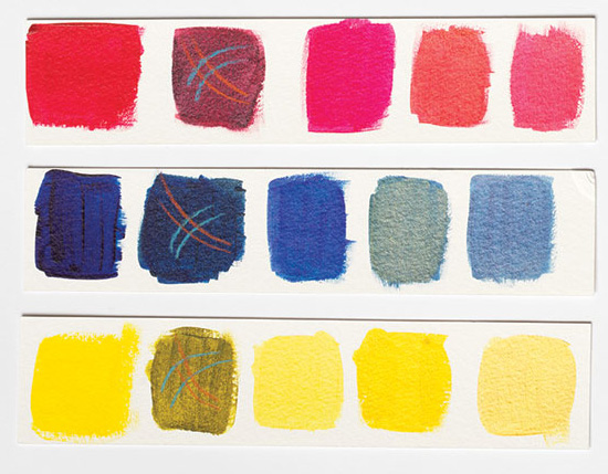
Start with a primary red, blue and yellow triad: quinacridone red (a cool red), anthraquinone blue and hansa yellow medium. All three are deeply saturated and intense pigments with strong tint strength — tint is the color that results from adding white to the original color. This means you can use very little paint to get great color. Combine the individual colors with each other to get crisp, clear and clean secondary colors: orange, violet and green. (Figure 1) Note: Tertiary colors can be created when the secondary colors are mixed with those adjacent to them. So far we can make at least 12 colors from just this one triad.
2. When Interference is a Good Thing
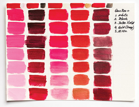
Add a magical interference color to the red, blue and yellow triad and create another set of 12 colors. The addition of the interference paint will create an opalescent quality that refracts light and alters the original to which it was added. Now we have 25 colors: the interference alone as well as the mixtures. My favorites are interference violet and interference green. (Figure 2)
3. Illuminating Iridescents
Create a third set of 12 colors by adding a single iridescent paint color. The metallic reflective qualities of iridescent paints result in colors with high sheen which allow the light to dance on the surface. Because we can use the single iridescent as a stand-alone color, that brings us to 38 colors. I most often reach for gold (deep) or silver for this. (Figure 2)
4. MIO is a Go!
Add a fourth set of 12 colors to the tally by introducing micaceous iron oxide (MIO). This dark paint is actually gritty particles suspended in a clear binder that takes on the color of the pigment with which it is mixed. These grayed-out toothy mixtures are awesome additions to your color library. This will pop our list up to 50 colors because MIO is also a stand-alone color. (Figure 2)
5. Light it Up
Introduce titanium white. This highly opaque white paint will allow you to create a minimum range of at least six tints from each of the original 12 colors created from the red, blue and yellow triad. These 48 tints are a range of lightened colors that fade to the lightest pastels by increasing the amount of white added. They will also be denser and give you heightened coverage. This brings our count to 99 — since white can also stand alone. For those of you who are true color seekers, this minimum range is only the beginning. (Figure 2)
6. Adding Value
Bring carbon black into the equation. By mixing varying amounts of black with each of the original 12 colors you can create 48 additional shades of color. A dding either black or white to your colors will change the value. This brings us to 148 colors.
7. And Then There Were 154
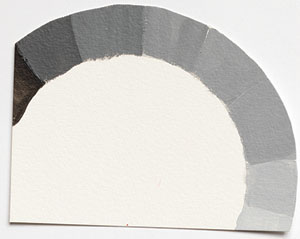
Lastly, create a range of neutral gray tones. Start with black on one end of your palette and gradually introducing white until you have created six or more tones of gray before ending with white. This is a neutral grayscale and will help you determine values. These final six colors bring our tally to 154. (Figure 3) You can stop with this amazing number of colors or continue to tweak and experiment to push your color mixtures well beyond these combinations. There is always another mixture that can be created when you combine both interference and iridescent colors together and mix them with the original 12 colors. Bonus: Try this exercise with two other triads: quinacridone magenta (R), turquoise phthalo (B), and nickel azo yellow (Y) or napthol red (light), hansa yellow light and phthalo blue (GS). Pick another interference and iridescent as well just for fun.
A Little Bit About Paint
Pigments are responsible for the color part of paint. The remainder of the bottle is made of a binder and some “fluff,” for lack of a better word. The fluff simply makes everything work together to keep the paint flowing, the pigments evenly distributed, and it allows the paint to stick to a surface. For acrylic paints, the binder is a polymer. If you’ve ever used polymer or gel medium you are essentially using “naked” paint or paint without pigment added to it. Learning to maximize your options saves you money and gives you a greater understanding of the color-mixing possibilities that exist.
A Colorful Vocabulary
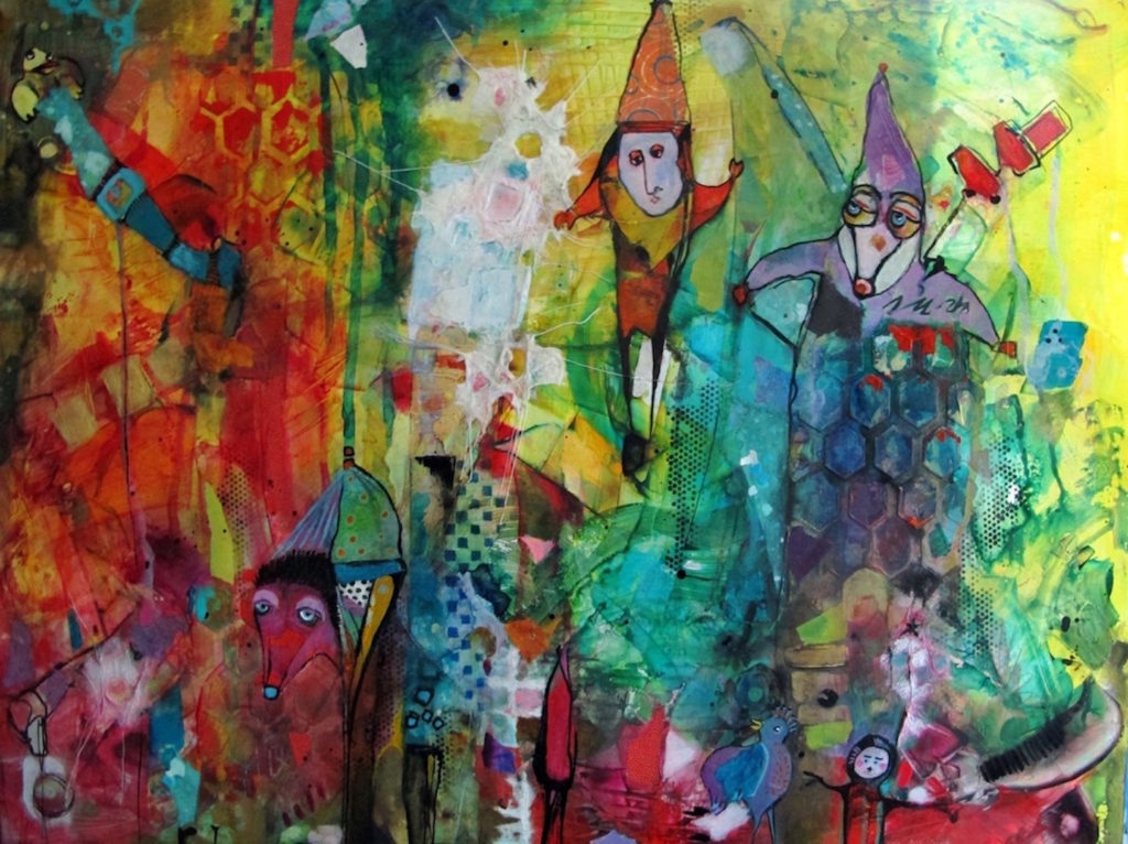
Color is what we see as we look at objects, people and landscapes and includes the full spectrum of the rainbow.
Color temperature refers to the warmness or coolness of a color. We think of red, yellow, and orange as warm colors and blue, green, and violet as cool colors. But an individual color can also be either warm or cool as in a cool red such as a quinacridone, or a warm red such as cadmium. Warm colors tend to advance or appear to come forward; cool colors tend to recede.
Grayscale is the range of tones from dark to light that is created when black is mixed with white. The tones created are referred to as neutral grays.
Hue is the name of an individual color (i.e. yellow, lemon yellow, hansa yellow medium, cadmium yellow, etc.).
Saturation refers to color in its natural form or full strength, the brightness or intensity.
Shade is the color that results when black is added to the original.
Tint is the color that results from adding white to the original.
Tint strength refers to the ability to maintain its strength when another color, such as white, is added to it.
Tone is a color that has been softened by the addition of neutral gray.
Value is the lightness or darkness of a color, or a color to which either black or white has been added. The values found in a grayscale are what you perceive when you look at a black-and-white photograph.
*A version of this article, written by Chris Cozen, first appeared in Cloth Paper Scissors magazine.


like this site…thanks ya’ll……….aj