Color Decoder: The Trouble with Green

Learn how to use this versatile, but sometimes challenging, secondary color to great effect.
This article originally appeared in Pastel Journal. Subscribe now so you don’t miss any great art instruction, inspiration, and articles like this one.
When we think of the color green, most of us conjure up a natural landscape replete with green trees and meadows. For vacation, we often seek out green spaces as a retreat from our hectic steel-and-glass worlds. No wonder, then, that green usually is considered a color that evokes a sense of calm and peace. Green can symbolize the positive—life and vigor, youth and hope—but also the negative, as in inexperience, jealousy, and even decay.

The Beauty of Green
Green lives between blue and yellow in the visible electromagnetic spectrum, between 490 and 475 nanometers. In our context of dealing with pigments, green is a secondary color, which means it can be mixed, in this case, from blue and yellow.
When most people imagine green, they often think of “grass green,” but for us painters, there are as many varieties of green as you might find in a botanical garden: yellow-greens (lime); greens with a touch of orange (moss); greens with red or violet (olive); and bluish-greens (fir). Interestingly, in some Eastern languages, there’s no distinction between green and blue; green is considered a shade of blue. Because green is a transition color between yellow and blue and contains both elements, it can help harmonize those two colors.

A Brief History
In their funereal adornment, the ancient Egyptians used malachite, a rich mineral green procured from mines across the Red Sea on the Sinai Peninsula. They also manufactured a less expensive alternative by mixing yellow ochre with blue azurite. The Romans dug terra verte, which was a dull earth green, from the ground. They also made a more intense green—verdigris—by soaking copper plates in fermenting wine.
Look for Michael Chesley Johnson’s workshop “From Study to Studio” at Art Fest in Mesa, AZ. Registration is open now!

Sap green, made from buckthorn berries, was used in the Renaissance period to color clothing for merchants and bankers. (Clothing color denoted social class or profession.)
Although green has been a commonly used color throughout the ages, most of these early pigments proved dull, toxic or prone to fading or discoloration. Because of the fickle nature of green, Renaissance painters preferred to create greens by glazing yellow over blue. Malachite alone provided a rich, lightfast color, but the color of the mineral varied and would change in the presence of acids.

The Manmade Pigments
It wasn’t until new greens were made in the laboratory that artists obtained truly bright, stable and permanent greens. Scheele’s Green, an early version of the pigment called Paris green or emerald green, was invented in Germany in 1814. Although an alluring color, this arse-nic compound was so toxic that it was used as an insecticide and rat poison. This didn’t stop painters like J.M.W. Turner (English, 1775–1851) and Paul Gauguin (French, 1848–1903) from using it, however.
Viridian or chromium green, similar in color to emerald green but nontoxic, was invented by color-maker Pannetier in 1838. With the advent of organic chemistry, we have other greens such as phthalocyanine green, which was invented in 1935. Many of the earlier, unsatisfactory greens have been re-created as hues or mixtures of stable, nontoxic pigments.

Quick Tips


Green in Action
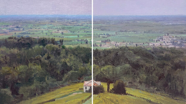
For landscape painters, green is often a challenge. Most landscapes display an abundance of the color, and as much as we enjoy the real thing in nature, in a painting the color can easily overwhelm the scene. Art instructors sometimes recommend that students facing this dilemma remove all the greens from their pastel box. This forces students either to find other options—such as painting sunlit foliage a bright orange and shadowed foliage a dull violet—or mixing a green by layering and scumbling. Blending yellow and blue, or two colors that contain these, such as orange and violet, can create a wide range of interesting greens. A third option is to mix red or violet into greens to moderate them. This approach also makes them appear richer than any one green alone. For shadowy greens, I like to mix in a little violet; for sunlit greens, I add a little warm red or even orange.


Green is also a useful color for figure and portrait painters. For centuries, it has been used to make flesh colors appear richer and warmer.
A green underpainting—bits of which show through the redder flesh colors—can make the flesh look more realistic. Surrounding a portrait with a dark, rich green can add a vibrancy to the entire painting.
Green is also commonly used in still life painting, as it makes reds richer; apples and roses, for example, can appear almost three-dimensional.
If you learn how to handle the color green effectively, you’ll make other artists green with envy.
Michael Chesley Johnson Workshops
Pastelist Michael Chesley Johnson (mchesleyjohnson.com) is the author of Outdoor Study to Studio: Take Your Plein Air Painting to the Next Level and other books, and is also a painting instructor who’s featured in several Artists Network TV videos (artistsnetwork.com/store). He teaches painting workshops throughout the United States.
Enjoying this article? Sign up for our newsletter!
From Our Shop








Join the Conversation!