Art After Dark
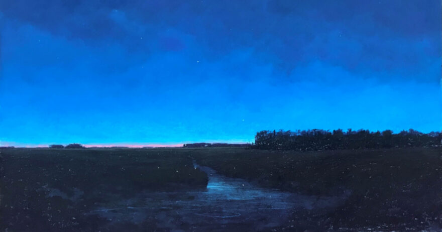
The evening hours invite artists to play with underpainting techniques, palette choices, and color combinations to create the unique qualities of the dark.
As the seasons change, we tend to dread the transition to shorter daylight hours and longer periods of darkness, but there’s a magical quality to a city street after dark, a breathtaking beauty in a nighttime sky, and a quiet tranquility to an interior room in low light. The 12 pastel artists featured here pages remind us that these later-in-the-day hours offer unique opportunities for capturing subjects and moods that are especially bewitching.
“I know nothing with any certainty, but the sight of the stars makes me dream.”
— VINCENT VAN GOGH
Kathleen Newman
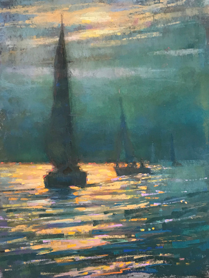
Into the Night was inspired by a late evening sail at the time of a pink full moon. The evening air was heavy and humid, and the foggy sky seemed to glow from within. When the clouds finally broke, the moonlight sent a brilliant sparkling reflection onto the water. I enjoyed the opportunity to use a variety of dark greens and blues to create the moody atmosphere of the night and to set up complements with pink and orange sparkles on the water. I started with an underpainting on UART paper, using dark blue-green pastel brushed with odorless mineral spirits. kathleennewman.com
Bethany Fields
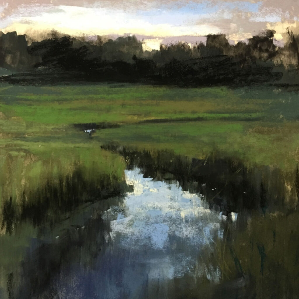
I came upon the scene that inspired Shem Creek while visiting family near Charleston, S.C., when my sister and I went for a walk at twilight. The sun’s lingering glow was everywhere. Nocturnes are more mysterious than paintings of afternoon or morning. Elements soften and deepen. The land puts on a different cloak. There’s a hum at twilight. Everything is waiting. Some things rest; some things waken. For the painting, I wanted to create a darker, moodier feel, so I began with a black underpainting, using charcoal and an alcohol wash on UART 500 paper. I purposely kept the colors muted and dark, leaving the glow in the sky and water as the brightest values. I loosely marked the distant trees and grasses with scribbles and scumbles. I wanted the piece to describe the feeling of being on Shem Creek, not the details of the landscape. bethanyfields.com
Kim Lordier
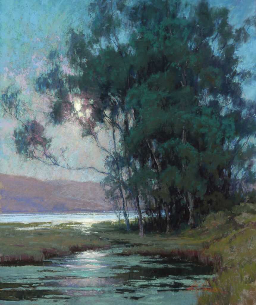
The Elkhorn Slough is a tidal marsh that I’ve been painting regularly for the past 15 years or so. The estuary is in the middle of Monterey Bay, Calif., and I’ve painted and photographed the slough in all seasons, at all times of day. In fact, I painted this particular scene during my very first plein air competition in 2004 at the Carmel Art Festival when I was six months pregnant. It’s a place that speaks to me both emotionally and spiritually. The painting was inspired by my study of the nocturne paintings of Frank Tenney Johnson [American, 1874-1939] and Grandville Redmond [American, 1871-1935]. I love the challenge of controlling values and keeping the tonal quality of color harmony tight. This location in full sun is quite outstanding, but the subtle qualities of moonlight and the reflections on the water at night are pretty spectacular, too.
Due mostly to scheduling, I don’t paint nocturnes as a regular habit. When I do, however, I find the quiet of the night is special. The color of night is a true change of palette, and it’s one that I love. kimfancherlordier.com
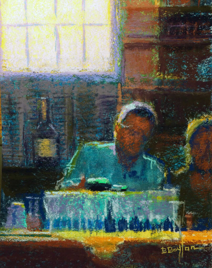
Brenda Boylan
To celebrate the 70th wedding anniversary of my aunt and uncle—which happened to coincide with my uncle’s 90th birthday—our family held a surprise party in a packed clubhouse pub. The backlighting from the window was bright, creating a dazzling sparkle of champagne bubbles and bottle, and rim light on the bartender’s head. My heart leapt whenI saw it and the posturing of the bartender, tending to our toast. I worked on a piece of Wallis sanded paper mounted on museum board, toning it first with a dark blue underpainting. My focus was the light, the edges of the champagne glasses and the bartender’s hair. I enjoy painting at the edges of the day. I practice plein air painting, and the biggest challenge when painting in daylight is that the sun and shadows move fast. Nocturnes and interiors are refreshing to paint because of the stable lighting situations. Also, I enjoy the freedom from detail in the dark areas of a nocturne. brendaboylan.com
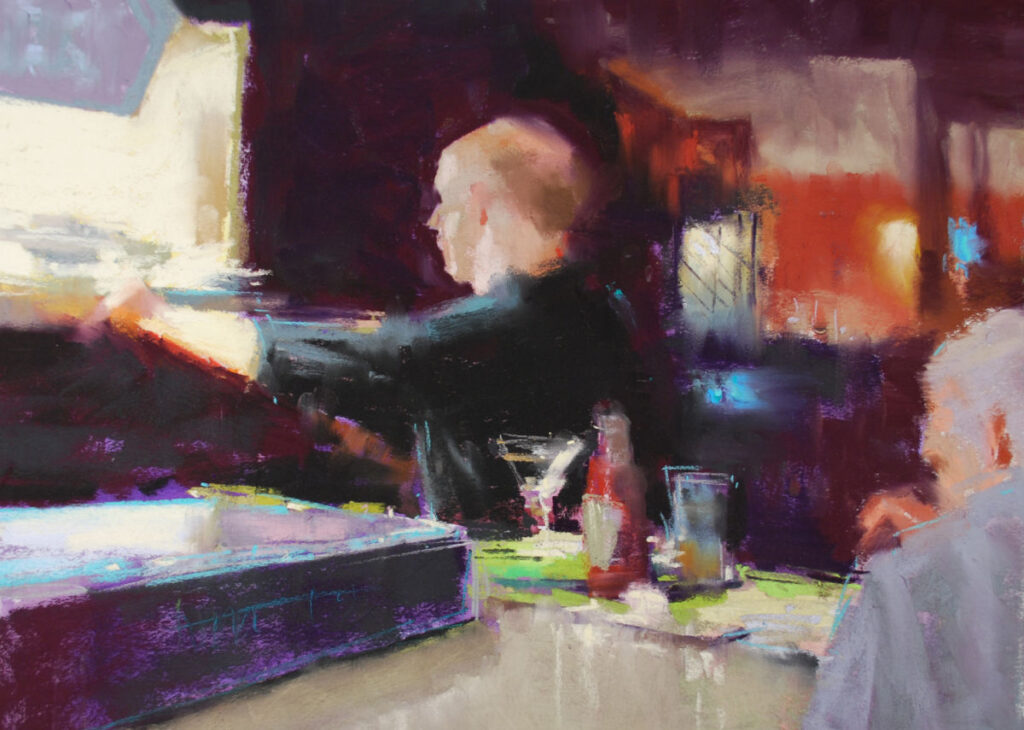
Marla Baggetta
The moment captured in Dinner With Mick took place in a local pub, one of those “Cheers”-like spots—comfortable and familiar. What I like in particular about the piece is that it’s figurative, but also has a second motif in the still life on the counter. I don’t often paint nocturnes, as I tend to work in a series, but I’m very attracted to the mystery and glittering light of the evening. There’s an intrigue that’s palpable—and hopefully paintable. The bright coronas and refracted light are magnificent to paint. marlabaggetta.com
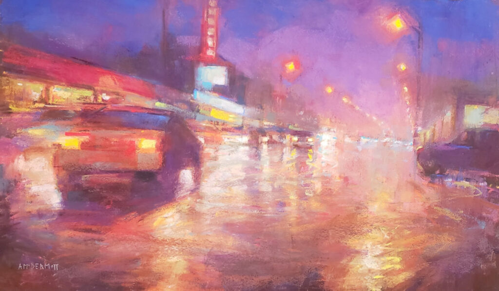
Andrew McDermott
This is a painting of one of the local streets in Vancouver. The time was just before nightfall when the light was fast-changing and the sky was filled with pinks and violets. I really wanted to capture the time of day and show the sense of movement of the cars. I love to paint nocturnes, especially urban scenes at night. I love how the lights from the street and vehicles glow in the night. I enjoy painting the lights emerging from the dark and how they reflect on the road. I can really play with the reflections, which helps to create a sense of distance in the painting. To capture the effects of artificial lights at night, it’s important to vary the brightness, making some lights more brilliant than others, which helps guide the viewer’s eye around the painting. Layering the colors is also key to create the look of glowing lights. mcdermott-art.com
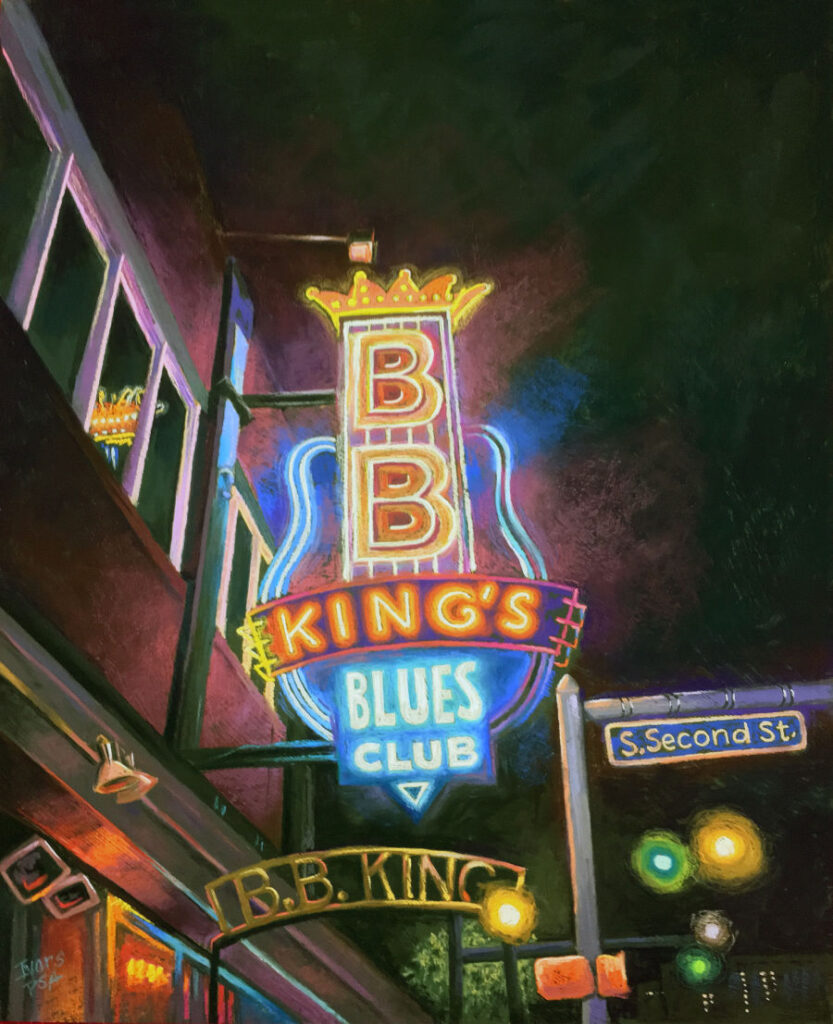
Christine Ivers
This painting is the result of a photo taken in Memphis. I was overwhelmed by the amount of neon—which I love to paint. It was pretty late at night, but I couldn’t wait to get to my easel to start playing. What has always amazed me about the nighttime lights is the endless possibilities for depth. By merging warm and cool colors in the darkest of backgrounds, the push and pull of those layers create a sense of distance without looking like a black cut-out. My palette ranges from white to black (yes, I use real black) with every other value in between. I love creating drama, and the contrasts in this scene—between the high-key neon lights against the incredibly dark sky behind them—made for a wonderful composition. christineivers.com
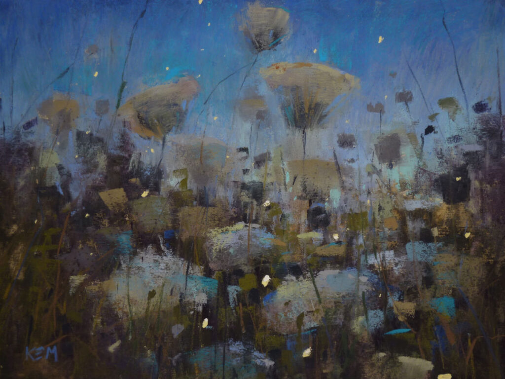
Karen Margulis
I was looking for a new painting challenge when I wondered what a meadow of Queen Anne’s lace would look like at dusk. I went to a spot near the house that’s filled with the plant, and spent time taking photos and watching how the light changed. By 9:20 p.m., the last of the sunlight was gone, and the sky took on the wonderful deep blues of evening. I could still see the flowers, but the colors were dark and dull. Still, I saw so much more on the scene than the photos showed. That’s the power of direct observation. As I left, the fireflies began to emerge—a perfect ending to the evening. I knew that they’d become part of the painting. I hadn’t painted nocturnes in the past, because I wasn’t sure how I’d translate my floral landscapes to the lighting of evening. After painting Fireflies in the Meadow, I felt empowered to tackle more. karenmargulis.com
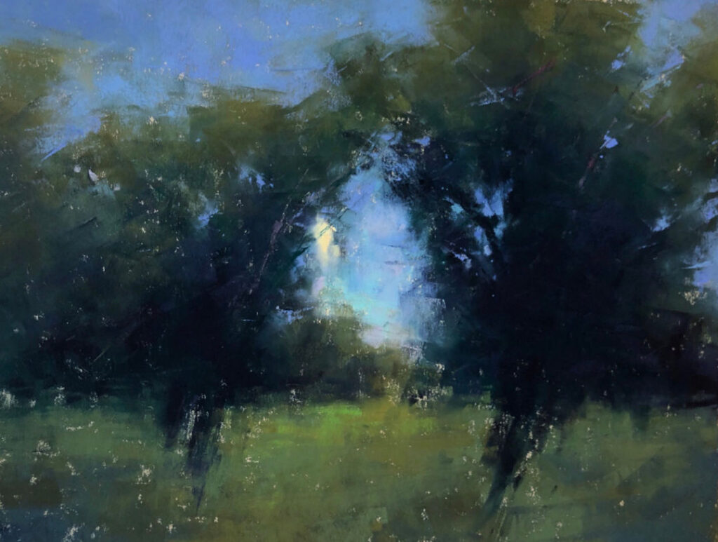
Jacob Aguiar
I came upon this scene during an artist-in-residence program with the Brinton Museum in Big Horn, Wyo. I was staying in a guest house at a ranch, and each night I’d see these cottonwood trees hit by moonlight outside my window. For my painting, I caught the moon as it was rising between these two trees, which framed it perfectly. I painted the scene without an underpainting, as I wanted to capture it quickly. My main focus was on balancing the mostly cool color with very slight additions of warm greens along the outer edges of the trees and along the top of the field of grass. jacobaguiar.com
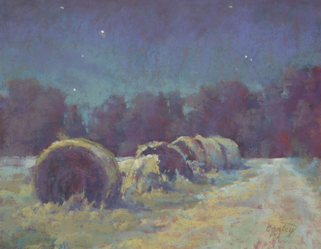
Lynda Conley
I became inspired to paint nocturnes after viewing paintings by Frederic Remington [American, 1861-1909] in some local museums. I made repeated visits to study his work, making notes on color and value. For Starry, Starry Hay, I decided to convert my photo of a daytime scene into a nighttime setting. I adhered to a more limited value range and utilized colors such as turquoise, violet, and an eerie green to make it convincing. I chose not to include the moon in this scene, thinking it would be a compositional distraction. The addition of a few stars, however, helped to indicate the night sky. lyndaconley.com
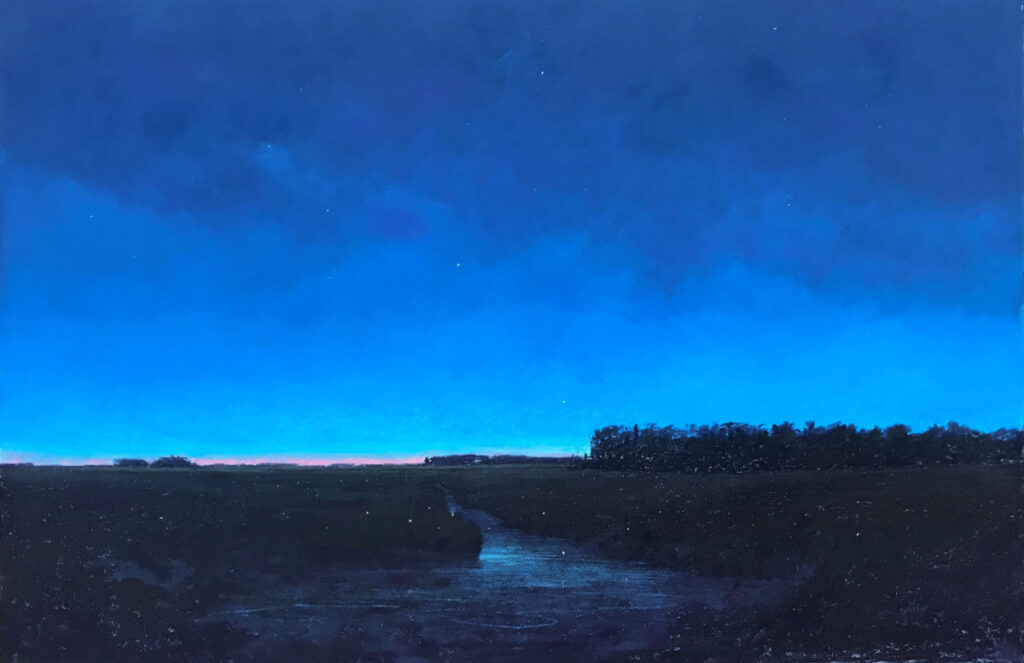
Stan Sperlak
I like to take walks on dark nights without moonlight. It takes about 30 minutes to allow time for my eyes to adjust enough to that darkness that I can discern starlight on my hands and the slightest of shadows on the ground. I live in the country, so there is little light pollution. On these summertime walks, the farm becomes a dazzling display as fireflies perform their nightly dance in the grass and shrubs before lifting high into the trees, where they escape the forests and become stars. This peaceful solitude is pretty magical, and to be able to portray that, well, that’s my story. In fact, nocturnes and twilight scenes make up at least 20 percent of my paintings. thesperlakgallery.com
Desmond O’Hagan
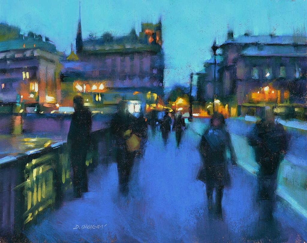
I find Paris to be especially captivating at night, and this image captured that quality with its complex combination of lights, figures and architecture. The scene allowed me to experiment with unusual combinations of colors for rendering shadows, reflections and movement. The light changed quickly as the sun set, and the street and building lights started to appear. I was inspired to try to capture that fleeting quality of evening light. Evening scenes have everything that I consider an enjoyable challenge: multiple light sources, jewel-like colors, movement and deep shadows. Much of this work is created using large abstract shapes and flicks of color that challenge the viewer’s eye to interpret detail that’s only loosely implied. In this piece, I experimented with combinations of warm and cool colors. The blues, which suggest the cool evening atmosphere, are a nice balance to the rich warm lights. I used a variety—from a light greenish blue to a dark bluish purple. The color combinations feel unique in the lighter areas and create mystery in the shadows. desmondohagan.com
About the Author
Anne Hevener is the editor-in-chief of Pastel Journal, Watercolor Artist and Artists Magazine. She has been writing about art and artists for more than 25 years.
From our Shop








Join the Conversation!