Creating Oil Pastel Scenes from Imagination: A Demo

With a flawless sense of value, oil pastelist George Shipperley applies arbitrarily chosen colors, bringing to light the images in his mind’s eye.
By BJ Foreman

The pictures George Shipperley creates are so lush and seductive, you want to go to those landscapes and sit beside those still lifes. But you can forget about that — unless you can crawl inside the artist’s mind.
“My work is 95 percent imaginative,” says Shipperley. “I prefer composing and creating my own subjects because doing so allows me freedom to concentrate on design and composition.” He maintains that subject matter is secondary, that interpretation, filtered through feeling and emotion, distinguishes one artist from others.
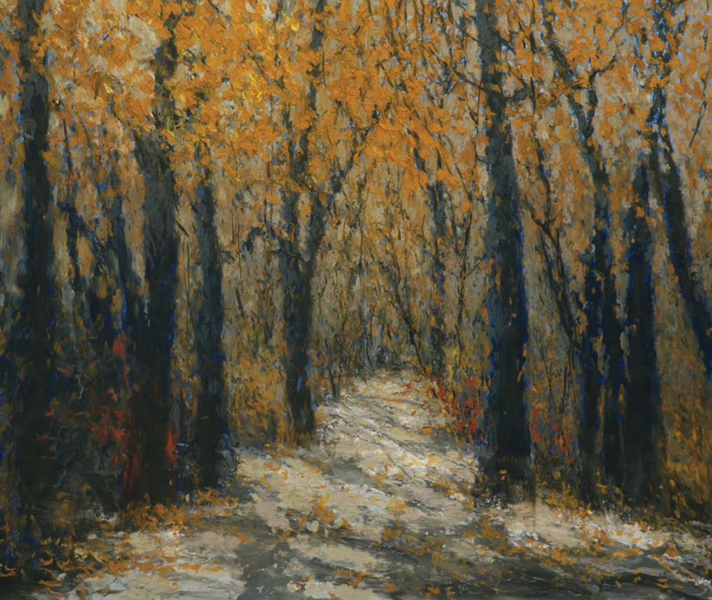
Here, Shipperley shares his artistic approach, as well as a demonstration of his process for creating Pathway, a landscape scene from imagination.

Value Acuity
Working mostly in oil pastel for the past 15 years, Shipperley punches up the colors you might expect in a landscape or still life until those hues leave reality far behind. The result is a view of magical places. While he does the occasional portrait and every now and then paints from life to create street scenes, his portfolio contains mainly imaginary landscapes.
The remarkable thing is that George Shipperley, master colorist, is color blind. Pure primaries are relatively easy for him to see. His favorite color is red. “When dealing with just that color,” he says, “I can see it so well — pure red or variations of it, like oranges. I like working with red and often start out with it on my palette.” As Shipperley progresses with a painting, however, adding colors and values, he finds that discerning reds from greens and browns or picking out blues from grays, and so forth, becomes increasingly difficult.
He’s never considered his color blindness a problem, though, because what he does see clearly are color values. “I don’t always know what the colors are. But I know when they’re right. I tell my classes, ‘Our imperfections can be the “plus” in our art.’”

Artistic Path
Shipperley fell in love with art while viewing the works of the Impressionists on his first trip to the Art Institute of Chicago. It was Jean- Baptiste-Camille Corot’s Arleux-Palluel, the Bridge of Trysts that hooked him. No surprise that this high-contrast painting of an idyllic scene did the trick. Other influences on his aesthetics are classical music, the biographies of great artists, and the landscape of the Midwest, which he prizes for the simplicity of its beauty.
Although becoming an artist was his high school ambition, Shipperley worked more than 30 years in the tire industry before taking an early retirement in 1994. He has been creating art ever since.
Oil Pastel Particulars
These days he’s able to paint 75 to 80 pieces per year. He works quickly and can complete a painting in a day. Larger works sometimes take a week. Some pieces get put aside until he has worked out the concept in his mind more clearly. He attributes the speed at which he’s able to turn out finished works to the oil pastel medium. Oil and acrylic painters must wait for their paints to dry between layers; oil pastel never really dries, thus lending itself to faster completion of a work.
The moist nature of the medium dictates that the finished work must be matted and framed under glass to preserve it. “Some people spray their work. I don’t advocate that,” says Shipperley. “If improperly applied, the spray can change the strokes and colors.”
He finds the adaptability and user-friendly nature of oil pastels comfortable. They offer him a versatility he was unable to achieve with other media. He’s adamant about using the finest materials — in his eyes, Holbein and Sennelier. He praises Holbein for its 225 colors and their density, which to him means less wax and more pigment. Sennelier Grand oil pastels, which are eight times the size of regular pastels, are another favorite of his. He finds the smaller Sennelier oil pastels are effective for creating creamy-textured finishing touches at the final phase of a painting.

Scoring the Subject
Shipperley stresses that he’s not a structured artist, nor does he use preliminary sketches. He makes all corrections during the painting process, which means he sometimes scrapes off everything with a single-edged razor and starts again. To Shipperley’s thinking, such setbacks can actually enhance the painting. “The residue left on the board is an excellent backdrop,” he says. “I’m just interested in the end result, regardless of what I need to do to get there.”
Over the years, Shipperley has become less interested in the subject and more interested in the design and suggestiveness of the subject. He has allowed himself the luxury of being strictly arbitrary in color selection. As he puts it, “Creating color is more important to me than attempting to imitate it.”

Shipperley’s Process
His first step in making his art is to decide what size board he’ll use and then apply 1-inch masking tape around the edges for a clean border. He particularly likes the square format.
If the subject is a landscape, he begins by drawing a horizontal line across the entire painting to establish the horizon (see the complete landscape demonstration below). For his still lifes, which are generally florals, he first outlines the basic shape of the vase or flower container.
He has no still life setup to refer to. Once he has established the design, he roughs in dark masses of color that will be the groundwork for stems or leaves of flowers. Next he scores the stems or leaves with a razor blade. “The scoring is permanent, so no matter what else changes, I won’t lose those marks.” He then adds an oil pastel line or outline, indicating a table or other surface upon which the vase is resting.
Next he removes some of the dark colors with Winsor & Newton Liquin in order to expose the scored lines. The idea is to remove just enough of the oil pastel to show the stems of flowers but still leave the floral mass tone on the board. He then draws in suggestions of individual flowers, adds whatever colors are necessary in the vase, surrounding area, and background, and completes the color and shape of the table. To finish the painting, he strengthens or weakens values as needed and applies highlights.

Always Experimenting
“Throughout the painting process, I often change my mind about what I’m doing,” says Shipperley. His color blindness necessitates experimentation; color harmonies present the biggest challenge but also the greatest rewards.
Like his beloved Impressionists, Shipperley uses a lot of gray. “I preach about it in my workshops,” he says. “I use gray to temper my colors, and there are many grays to choose from in oil pastels. These grays don’t stay gray, however; they become tones of the colors you’re using.”
For blending, he uses a single-edged razor and paper towels to rub color into the board with Liquin. “This process,” says Shipperley, “gives a wonderful tonal effect that can be controlled either by the amount of medium used or the pressure and extent of the rubbing.”
Extracting the Essence
For an artist who had to put his dream on hold, Shipperley is going full speed ahead these days. The style he has developed helps him create art in a torrent. “I tell my students not to get hung up on what they’re painting but rather on how they feel about what they paint. You can paint with your hands and eyes, but you must paint from your heart.”
As his work evolves, he finds he’s able to leave out more and more details. “Maybe I’m painting too many leaves on flowers, too many trees in a landscape, too much detail on the ground,” he says. “It’s like throwing a bunch of stuff into a sieve, and what’s left is the essence.”
Demo: Forest Tonalities

Here, George Shipperley shares his process for creating Pathway.
I base my landscapes upon years of observation of the natural world. But the particular scenes I depict come from my imagination. For the painting that would be Pathway, I saw in my mind a dense forest with a path going straight through.

1. Draw horizon line.
Generally, when I paint a landscape, I establish a basis for the composition by first determining the horizon line. I did this in a dark color, ultramarine blue, and then added lines indicating a path.

2. Mass shapes.
Still using ultramarine blue, I began massing in the shapes. I used the same color for the sky, tree, and ground masses so I could establish an overall tonality.

3. Add darks.
I increased the darkness and density of the tree and ground masses, adding black to the ultramarine blue. This created a contrast with the sky and added depth to the trees. Many artists in other media avoid using black, but I find it very useful with oil pastels.

4. Blend with medium.
Here you can see that the linear markings in the sky, trees, and ground have begun to disappear because I rubbed those areas with a Scott paper shop towel moistened with Winsor & Newton Liquin Light Gel medium. This blending of the marks introduced more tonalities.

5. Add trunks; subtract darks.
I added the trunks and branches, which I thought of as directional compositional elements rather than as trees. I was working with an arrangement of negative and positive spaces as I established the more important, solid tree trunks. Besides drawing in the trees, I also rubbed out some of the dark mass with medium to give the appearance of light coming through the trees. In the image you see me blending the sky color and softening the edges of the trunks and branches with a shop towel. I also added some gray tones to the path.

6. Begin foliage; harmonize colors.
I then introduced the ochres and yellows, making this a fall scene. At this stage I was setting the overall pattern of foliage, taking the fall colors all the way to the ground, which established how much foliage I’d add and where I’d place it. This step also helped me determine where I would put the highlights and other tonal variations. Notice that I still let quite a bit of the blue sky show through. At this stage I also began adding browns to the trunks to make them more harmonious with the foliage.

7. Add values.
Applying stroke after stroke, I increased the sense of depth with additional color values — two or three different shades of the ochres and golds and yellows. At this point, much of the sky had disappeared, although I was careful not to cover all the blue; we see the sky through the trees, no matter how dense they are. I also began the tree shadows.

8. Harmonize colors; soften edges.
I continued to work with the foliage. I also made the ground color and trunks more harmonious with the colors of the forest and then blended the edges of the shadows, thus finishing Pathway (oil pastel, 20×23).
Meet the Artist

In the midst of his 30-plus-year career in industrial sales, George Shipperley and his wife, Lois, opened the Henrich Art Gallery and Custom Frame Shop in Aurora, Illinois, which they ran successfully for 34 years before closing the operation in 2011. Shipperley wasn’t able to focus on his own art until he retired from sales in 1994. He’s taken classes at the Art Institute of Chicago and studied under Ruth Van Sickle Ford and Marianne Grunwald-Scoggin.
Shipperley is the first artist to have been awarded signature membership in the Oil Pastel Society; he is an award-winner in The Artist’s Magazine’s 2011 Annual Art Competition and 2014 Over 60 Art Competition. He’s also a 2014 inductee into Illinois’s Fox Valley Arts Hall of Fame. Edgewood Orchard Galleries (Fish Creek, Wisconsin), Maggie Black gallery (Galena, Illinois), Proud Fox Gallery (Geneva, Illinois), and Artisan Gallery (Paoli, Wisconsin) represent his work. He also teaches classes and workshops. For more information, go to georgeshipperley.com.


I love oil pastels, but how to protect them from getting dirty, to store and to display these works of art?