Landscape Color Palette Secrets for Plein Air Painters
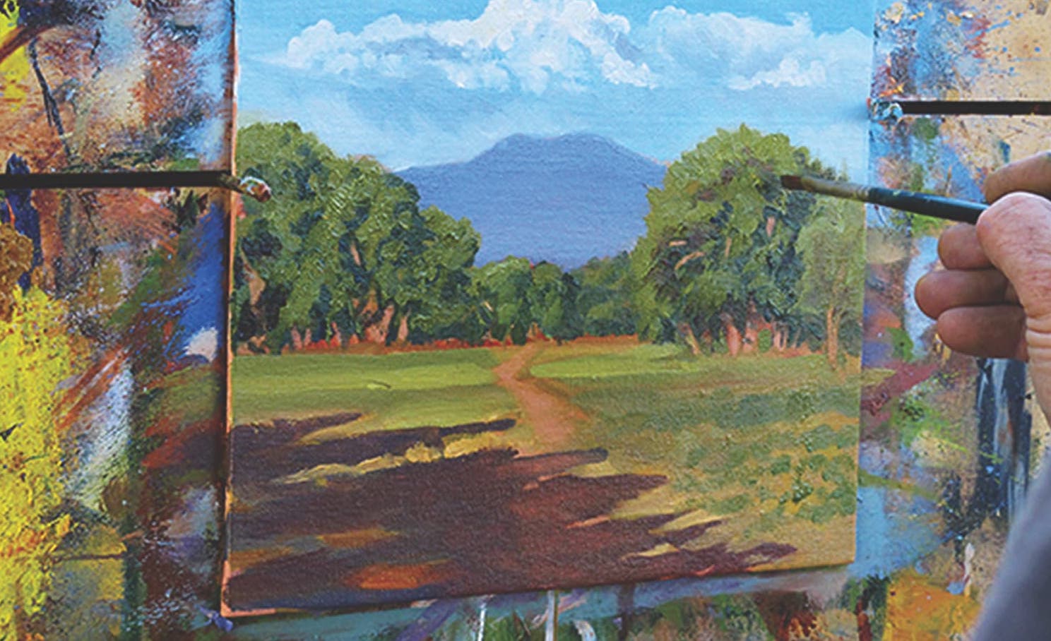
In this step-by-step demonstration, discover a foolproof color-mixing method to read local color and recreate it in your landscape color palette.
By John Hulsey and Ann Trusty

Painting outdoors on location poses unique challenges compared to painting in the well-controlled environment of the studio. One quickly realizes how difficult and frustrating it can be to create even a small painting during the hours spent outdoors. In the detailed demonstration that follows, you’ll learn the method that we’ve developed to teach plein air painters to create an ideal landscape color palette. We’ll begin with how to quickly analyze local color and values, then pre-mix all the colors needed for the painting and develop a consistent color harmony among the premixed colors.
Step 1A
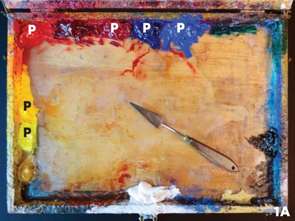
We recommend that you become thoroughly familiar with the concept of color temperature and complementary colors. A split primary palette consists of a warm and a cool of each primary — red, yellow and blue. In photo 1A, above, we’ve marked the primaries with a “P.” Going clockwise from lower left, these colors are:
- lemon or cadmium yellow light
- cadmium yellow medium
- cadmium red medium or light
- quinacridone rose or alizarin crimson
- ultramarine blue
- cobalt blue.
It can be helpful to think of the warm primaries like cadmium yellow as “one yellow, one red,” and ultramarine as “one blue, one red.” This is important for obtaining clean, rather than muddy, colors. Muddy colors can often develop from mixing complementary colors, or colors with a complementary component in them.
Over time, you’ll arrange your primary colors to your liking. We’ve placed our reds and yellows like a color wheel to reflect our preferences. Once you arrive at your optimal arrangement, don’t change it. That way your brush can always easily find the right color.
Step 1B

After you’ve arranged your colors, mix three secondary colors from the primaries on your palette. To save time in the field, we suggest that you mix your secondaries in advance in your studio. Photo 1B, above, shows our cadmium orange mix, for an example of a secondary color.
You might wonder why it’s important to mix secondaries when you can easily purchase them ready-made. We believe that the only way to truly understand color relationships is to experience mixing them on your own. You’ll acquire confidence and speed from knowing which colors will make which tones and how colors affect one another, and this skill will undoubtedly improve your paintings. Additionally, when you take the time to pre-mix your colors, you can spend your time en plein air painting, not mixing.
Take your time when you’re mixing the secondaries. It’s very important to mix them so that they don’t lean toward one or the other primary. They should sit right in the middle. Compare them to the pure primaries as you mix, using your palette knife like a trowel or cake spatula to smooth the colors into each other with a flat, sawing motion. Then place the finished colors on your palette where you can cross-mix them to develop those beautiful grays.
Step 2

Locate your subject and set up your gear. Then, develop an effective composition and draw it onto your canvas or panel.
Step 3

Using your palette knife, mix the colors found in your landscape subject. We suggest that you first mix only the largest masses of color, which you can find by squinting. As you mix these colors, constantly compare them in value to your subject. This process is made simpler by using a sight-through gray scale, as shown above in image 3. First, align the observed value of the major landscape masses to a point on the scale. Then, mix your color using a palette knife to match the gray value.
Try to get in the practice of using a gray scale for every plein air painting. It will sharpen your value perception. In this painting, we have two main masses of color: One is green and one is violet, both secondary colors.
Step 4

To create a “color string” of the tones in your large color masses, drag the green (G) toward the yellow, as in image 4 above. Use the flat part of a large palette knife with a sliding, sawing motion to pick up some yellow and work it back toward the green. Repeat this action until you get a smooth transition from yellow to green. Drag a small amount of the green over to the cobalt blue and then work that back again toward the green, as you did with the yellow. Repeat this operation until you have a gradated set of colors that represent all the various tones of the green as it changes in hue from yellow to blue or warm to cool.
This is what we mean by a color string. Afterward, to get the very warmish green tone we needed for the painting, we also worked a bit of the pre-mixed orange secondary color into the green color string.
Step 5
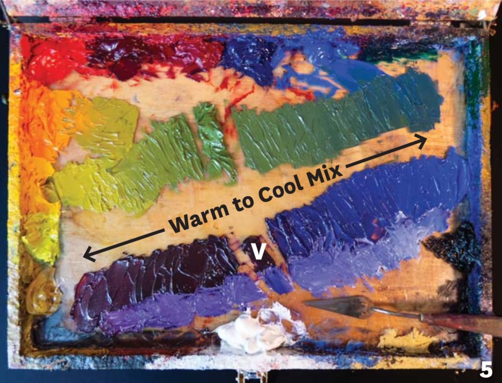
Next, perform the same operation with the other mass tone — the violet mix, as in image 5 above. At the lower left, we placed a small pile of quinacridone rose, which we mixed toward our pre-mixed violet pile (V) in the center. (To make it easier to see the effect of this dark mix, we added a bit of white below it.) To move the violet toward the cool side, we mixed toward a pure cobalt blue, at right. Never worry about mixing too much or wasting paint. This is the Achilles heel of novice painters, and the sooner one gets past this erroneous notion, the better. Paint like a rich person, and your paintings themselves will become richer for it.
Step 6

Let’s take this a step further and create some colorful, harmonized grays between our two main color strings. These grays are beautiful. Joaquín Sorolla is said to have called grays “the money colors,” and he was right. The majority of our paintings should consist of colorful grays such as these, with only touches of pure colors here and there to bring everything together.
These are now all the colors we’ll need to complete the painting, and because they all share something with each other, they’re all in harmony.
Step 7

Paint the entire picture with only the colors you’ve mixed, without adding new ones. If you do add new colors, they’ll stick out like a sore thumb. If you run out of a particular color, stop and remix it the same way you did before. Over time you’ll get a sense of how much paint to mix up front.
Our original two mass-tone colors now work as pure hues, while all the other mixes are gradations of those main tones. It’s a simple matter at this point to add white to any of these colors to create a tint or highlight, or to add black to make an accent. When you need a lot of a highlight color, start with a pile of white paint first, and then add small amounts of your premixed color to it, not the other way around. You’ll avoid wasting lots of white paint this way.

With these color-mixing tips for your landscape color palette, you’ll be well prepared to take on the plein air challenge with more proficiency and joy.
JOHN HULSEY has had exhibitions throughout the United States. His work was featured on the cover of Time magazine. He’s been teaching plein air painting for more than 30 years. Learn more at johnhulsey.com.
ANN TRUSTY is a third-generation artist. Her paintings have been featured in museum and invitational gallery exhibitions in the United States, France and Turkey. Learn more at theartistsroad.net.
A version of this article first appeared in Artists Magazine.

Have a technical question?
Contact UsJoin the Conversation!