AN Archives: John F. Carlson
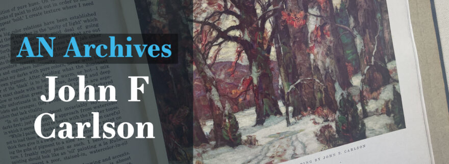
A true pioneer of landscape painting, John Fabian Carlson had a remarkable journey – from his early beginnings in Småland, Sweden, to ultimately settling with his family in Buffalo, New York. It was there that he first achieved recognition for his work at the Swedish-American Exhibition and later when appointed as director of The Woodstock School of Landscape Painting. His skillful eye is now accessible through Carlson’s Guide To Landscape Painting, which provides valuable instruction on how to master this complex art form.
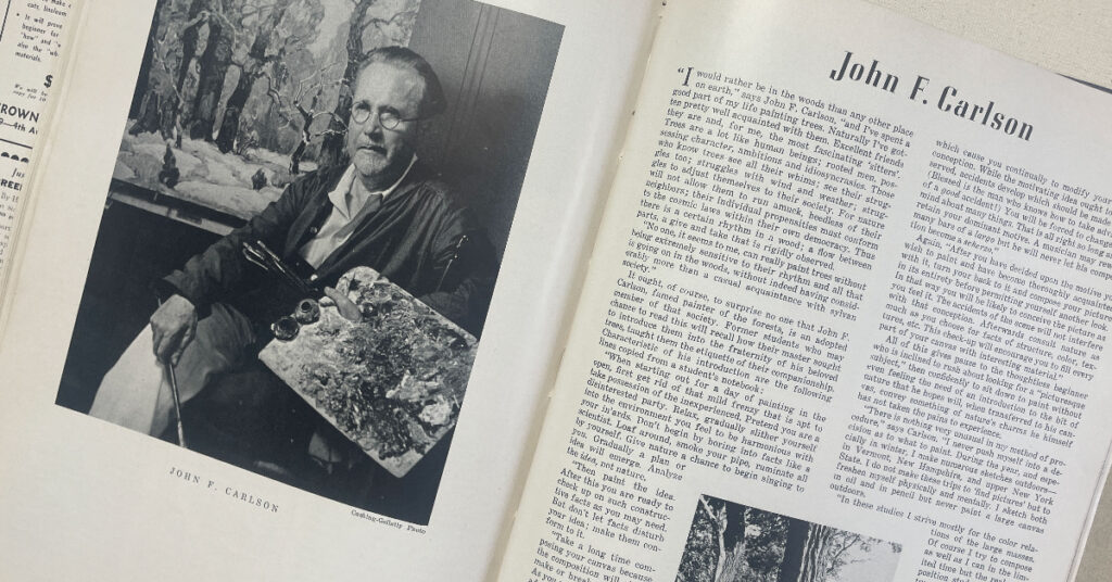
John F. Carlson was featured in the December, 1942 issue of American Artist Magazine. Here are three takeaways from the article that reveal his influential approach to landscape painting.
1
In the Studio. Studies were made in nature, serving as a starting point for work in the studio. These small-scale studies were completed with pencil and oils, and then the larger paintings were then created in the studio. Carlson described the process: “In these studies, I strive mostly for the color relations of the large masses. Of course I try to compose as well as I can in the limited time, but the real composition studies for my pictures come later. Back in the studio, the real creative work begins. The impressions gleaned from my study in the woods begin to crystalize. I don’t start to paint until I can see the picture in my mind’s eye as clearly as though it were before me on the canvas.”
2
Composition. Carlson’s compositions were inspired by nature, but not bound to it. He said, “Take a long time composing your canvas because the composition will either make or break the picture. As you work along, don’t be afraid to make drastic changes as they suggest themselves. They will be suggested; compositional needs spring up because of the things you have already set down on your canvas. When you feel a composition needs to be changed, change it at once before the composition changes you.”
3
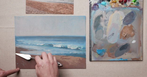
Process. His paintings started with line-work with pencil and violet-gray paint. The darks were established next, using pure, rich colors. From the darks, he worked towards the light areas, preferring to paint with a palette knife and stiff brush in thick, bold layers. He worked with a palette of Lead White, Lemon Yellow, Cadmium Light, Cadmium Medium, Transparent Gold Ochre, Cadmium Red, Rose Madder, Veridian, Permanent Green, Burnt Sienna, Prussian Blue, Cobalt ( for Still Life), and Ultramarine (for Florals).






Join the Conversation!