Color Decoder: The Positive Energy of Orange

Learn all about orange—and how to use its vibrancy to impact other colors.
This article originally appeared in Pastel Journal. Subscribe now so you don’t miss any great art instruction, inspiration, and articles like this one.
Without orange,” wrote Vincent van Gogh, “there is no blue.” Brilliant, hot orange. Wrap it around blue—its complement—and you’ll not only increase the intensity of the blue, but you’ll also raise orange to a feverish pitch. But even on its own, orange is a color we associate with fire and energy. When you look at a set of brand-new, pristine pastels, orange is the one color that seems to want to jump out and be put to immediate use.

In Calling the Cows Home (ca 1872; oil on canvas, 37¼x25½), by Jean-François Millet (French, 1814-1875), the artist uses orange as the dominant color. In addition to the brilliant sunset orange, he uses more muted and darker versions, all verging on brown, in the middle and foreground areas. To make the orange of the sky more brilliant, he uses violet, orange’s near-complement, in the distant hills.
The Beauty of Orange
Orange occupies a thin slice of the electromagnetic spectrum, sandwiched between yellow and red in the 585 to 620-nanometer range. In nature, it’s found most often in fruits and vegetables due to carotenes—photosynthetic chemicals that turn light into chemical energy. The orange we see blanketing the hills in autumn results from the carotenes being revealed after the green chlorophyll of summer has vanished. Orange is also found in the earth, resulting from iron oxide or rust.
For painters, orange is a secondary color, meaning that it can be mixed from primary colors yellow and red. As with yellow, it can be used in mixtures to make a wide range of warm and varied hues, from neutral browns and grays to luscious greens.

Shifting the color temperature can be useful in creating a sense of strong sunlight. In Mitten Ridge Sketch (12×9), I’ve taken the warm oranges in the shadows and, in the sunlit areas, have pushed them beyond red and into red-violet. The temperature contrast works well to strengthen the illusion of sunshine.
A Brief History
Although most earth pigments are either yellow or red, some of the ochres can be considered orange in hue. Ancient people, however, discovered a brighter orange in realgar, an arsenic compound found in some mineral deposits. Despite its expense and toxicity, realgar was widely desired, thanks to its rich color and lightfastness. But in 1809, chemists created the cheaper and somewhat less-toxic chrome orange from lead. Although it rapidly replaced realgar, it wasn’t as lightfast. This pigment was used until the more permanent and still somewhat less-toxic cadmium pigments, such as cadmium orange, were created in 1840.
Look for Michael Chesley Johnson’s workshop “From Study to Studio” at Art Fest in Mesa, AZ. Registration is open now!

The French Impressionists enjoyed both cadmium and chrome orange. It wasn’t until the late-19th century that chemists discovered organic pigments, which are intense, permanent and non-toxic, and have a greater tinting strength than any of the earlier pigments. Hansa (or azo) orange is one such pigment.

Bright orange and dull brown—which is just orange very much muted and somewhat cooled—also can be used to make a sunny painting glow, as in Steamboat Rock Glimmer (5×9).

Orange and blue-violet are near-complements. Large quantities of each in Red Mountain Snow (9×12) help make each color appear more intense.
The Three Pigments
There are three kinds of pigments: earth, mineral and organic. Earth colors, like the ochres, are our oldest pigments and have been dug from the ground for thousands of years. Opaque, they also contain impurities that reduce the color intensity naturally. Mineral pigments, such as cadmium sulfide, were derived from metals during the early years of the Industrial Age and gave us brighter colors. Organic pigments, such as monoacetolone, contain carbon and were invented only in the last 100 years or so. These yield our most intense oranges.
Quick Tips

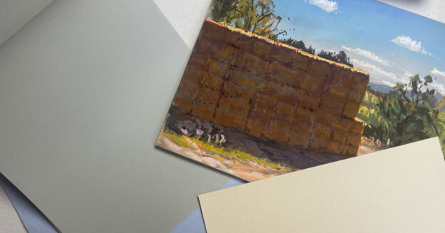
Oranges can be bright, intense colors; pale, fleshy tints; or deep, dark browns. This set of Blue Earth oranges on a sheet of Elephant Art Spectrum Colourfix paper shows the range from dark to light, intense to dull. Darker oranges are made by adding red and black to orange; lighter oranges, by adding white. More neutral oranges are made by combining blue, which is orange’s complement.
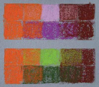
Orange is great for modifying violets and greens. In the top illustration, I’ve taken two values of orange—an intense, mid-value version, plus a more neutral, darker one (brown)—and have used them to modify two different values of violet. The first row shows how a light violet can be modified; the second, a dark violet. In the bottom illustration, I’ve taken the same two values of orange and have used them to modify two different values of green. The first row shows how a light green might be modified; the second, a darker green. Using one value of orange to modify the same value of violet or green results in a smooth, optical blending of color. On the other hand, using one value of orange to modify a very different value of violet or green results in a rougher blending.
Orange in Action
Like van Gogh, painters have learned that complementary colors placed next to each other intensify both colors. This also works to a lesser degree with near-complements. If you choose the right orange, for example, you can achieve this effect with greens. To spice up a landscape with lots of green, I first may tone the painting surface with a mid-value orange pastel, using alcohol or mineral spirits to liquify the pigment so I can get even coverage. When I add more layers of pastel, I’m careful not to cover up this tone completely, leaving flecks of orange showing through to spice up the greens. I avoid red, green’s direct complement, which would make too garish a contrast.

Orange, green and violet make a triad of secondary colors, a useful scheme for creating color harmony. In After December Rain (12×9), I shifted the violet to a red-violet in the distance. The red-violet and orange share a single color—red—which makes them an analogous pair, culminating in a harmonious triad.

Touches of bright orange in the blue-greens of the water in Three Rocks (9×12) indicate strong sunshine reaching into the depths.
I also use orange to modify other colors, usually purple and green, as in After December Rain. Because orange and purple both contain red, orange can be used to gray purple in a less aggressive fashion than yellow—purple’s complement—alone. Likewise, because orange contains not just red but also yellow, like green, it mutes greens in a less aggressive fashion than does red alone. Purples and greens, when modified with orange, take on a luscious warm tone that’s perfect for autumn colors and shadows. By gently feathering an orange pastel over these colors, I can create rich browns.
The late singer Frank Sinatra supposedly said, “Orange is the happiest color.” I don’t disagree. Take some of that colorful cheer and spread it around.
Michael Chesley Johnson Workshops
Pastelist Michael Chesley Johnson (mchesleyjohnson.com) is the author of Outdoor Study to Studio: Take Your Plein Air Painting to the Next Level and other books and is also a painting instructor who’s featured in several Artists Network TV videos (artistsnetwork.com/store). He teaches painting workshops throughout the United States.
Enjoying this article? Sign up for our newsletter!
From Our Shop









Join the Conversation!