Birgit O’Connor’s 25 Tips for Painting a Watercolor Flower

Painting a Watercolor Flower: Petals and More!
Birgit O’Connor is completely blissed out on watercolor flower painting, and spending time painting flowers has taught this popular instructor a lot. She shares 25 tips for creating a dynamic watercolor flower painting that can be a vehicle for freedom of expression to play with water, color, movement and design!
Reference Photo Tips
1-Organize your photographs or digital images by subject, color, size or other categories into files, either in a box or on your computer, whatever works best for you and will make them easy to come back to later. With flowers, this tip is especially important because the subject matter can tend to blend together unless you group the photos in an organized way.
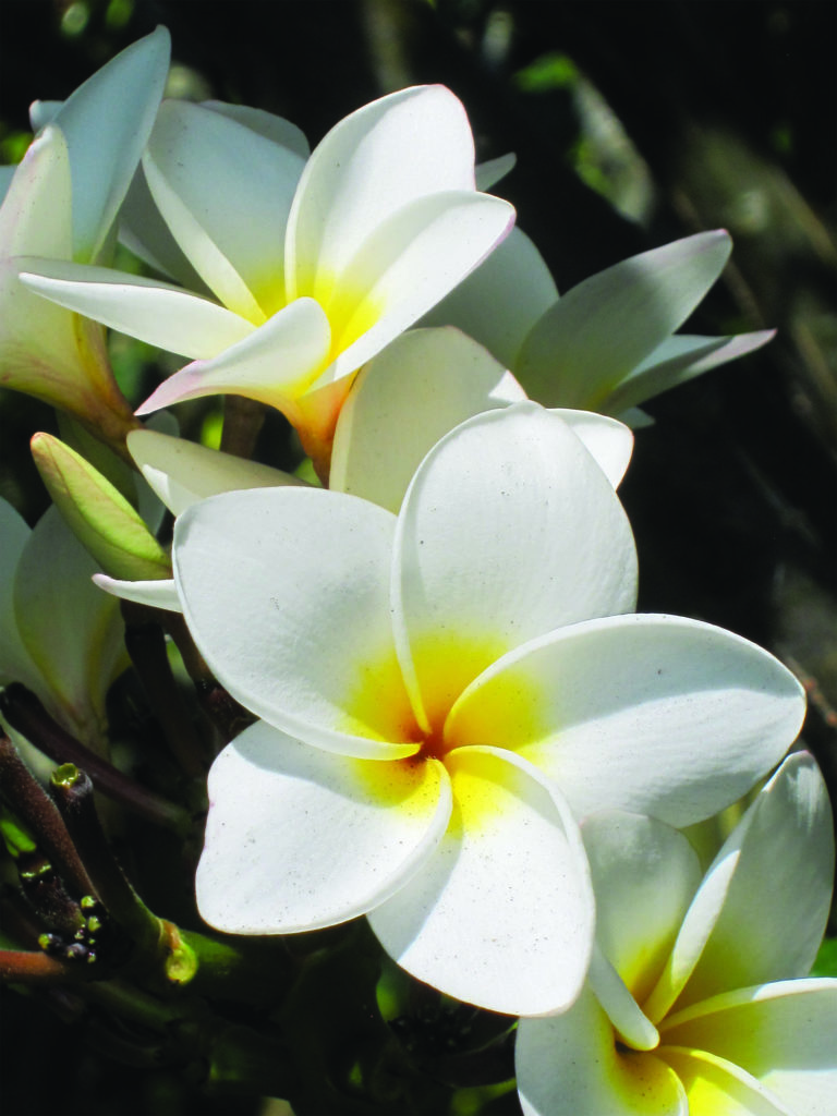
2&3-Two of the most common mistakes people make when taking reference photos is standing too far away from their subject and taking only one picture. If you take only one shot, the lighting or color may be off, a shadow may be in the wrong place, the image might be blurry or you could cut off important parts. Be sure to take multiple shots, from up close and farther away.
Composition Tips and Strategies
4-No kissing edges! Avoid having the edges of elements barely touch in a painting. Elements connected in this way create weaker shapes and distract the viewer, making them pause for a moment while they try to figure out the problem instead of engaging them in the painting. It’s better to have the edges of a subject overlap instead, or for those that will be separated, make sure it is not by equal distance.

5- Simplify your composition with a close crop. You don’t need to capture all the petals to make an interesting composition. Cropping to the center of a single flower and using the rule of thirds to place it creates a much stronger and more intriguing design.
The Importance of Shadows
6-How dark should a shadow be? In general, think of the shadow as being 40 to 50 percent darker than the lightest area of an object—but this is subjective to the light source and how much filtered light is able to come through. Reflected light is also a consideration, and how much light bounces off of surrounding objects and reflects back into shadow. This helps to add dimension, bring life to uninteresting areas and give shadows a glow.
7-Shadows are more believable when they fall in the same direction, and this is always on the opposite side of the light source. So when doing a painting, all shadows need to be on one side.
8-The length of the cast shadows under your flowers will depend on the time of day and season of the year. For instance, midday or summer shadows can be short or almost directly under an object, while evening or fall shadows appear long. Decide the length, load the brush with enough water and color, then apply in sweeping strokes. Avoid outlining the shadow shape, or the outline can dry faster than you are working, which results in a shadow that looks labored rather than effortless.
Petal Time
9-Painting the center of a rose is a great lesson in layering. Start with a light-tint underpainting (wash of color) and work one petal at a time. Keep the darker values directed more toward the bottom of the petals inside the center and transition them into lighter values as you move up and out toward the edges.

10-A white background allows the viewer to focus on the pop of color your flowers bring forth without the challenge of deciphering its surroundings, and it relieves the artist from having to give extra thought to the background. But, depending on the composition, the painting can feel incomplete.

11-To prevent a painting from looking flat and to make the background more interesting, try using transitional values that gradually become lighter or darker from one side to another. To harmonize the painting, use some of the same background color in the shading of the flowers. A background like this is perfect for highlighting bright white flowers.

Try Outs
12-Also known as Dura-Lar (made by Grafix), this film is a mix between Mylar and acetate and has a coating on it that accepts all water-based mediums. Unlike regular acetate where water and color beads and runs, this product accepts water and holds color where needed, and color will dry nicely on the surface.
It is available in a variety of sizes as well as in rolls (when purchasing, make sure the words “wet media film” are on the label).
To test a background idea, cover the painting with a sheet of the wet media film and experiment with color you like in the areas you want. To reuse, simply wipe with a damp cloth.
13-For shadows in the center of a flower, try making them on your practice sheet of watercolor paper first before adding them to your painting. For example whine painting daffodils, on the palette, mix two separate puddles of Hansa Yellow Medium and Indian Yellow (or simply use one color).
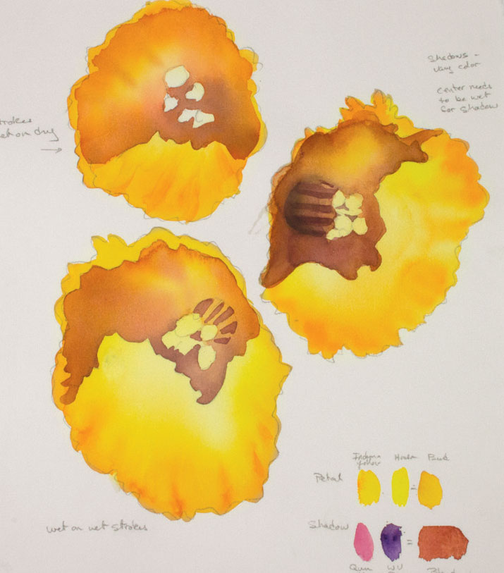
In one puddle, add a little Quinacridone Magenta to make a stronger orange, and in the other introduce a tiny amount of Winsor Violet (or you could substitute Daniel Smith’s Carbazole Violet). Then make a separate puddle of Quinacridone Magenta with a small amount of Winsor Violet (Dioxazine) mixed in. Paint sample flower centers and let it dry and then assess which will work for you.
More Depth
14-Using your same petal colors, but in darker values, do a little negative painting to develop the petal shapes by applying color around the areas you want to lift away from the flower.

15-Work on the overall painting one area at a time, using different values of the same color mix. At this point, each petal should have only one layer of color. Let it dry. Repeat with another layer where needed to build color. Using the same water and color application, continue to fill in the other petals and paint your way around your flowers. As you do this, allow variations of the two layers of color to mingle directly on the paper.
Flower Palettes
16-For a peony palette, mix different puddles of pink on your palette to find the color blends that you like. Try:
• Quinacridone Pink + Permanent Rose
• Permanent Rose + Winsor Blue (Red Shade)
• Quinacridone Pink + Winsor Blue (Green Shade)

17-Color combos to try for rhododendrons:
• Winsor Blue (Green Shade) + Quinacridone Magenta
• Winsor Blue (Green Shade) + Quinacridone Pink
• Winsor Blue (Green Shade) + Permanent Rose
• Winsor Violet (Dioxazine) + Quinacridone Pink
• Winsor Violet (Dioxazine) + Quinacridone Magenta
• Winsor Violet (Dioxazine) + Permanent Rose
• Indigo + Permanent Rose
• Indigo + Quinacridone Magenta
18-Sunflower shadows! Each sunflower faces a different angle, so the shadow color of each will be slightly different. The flower on the left receives more light than the one on the right, which is facing away and will be just a little darker. Also, since we are adding the shadows on top of the yellow, we need to be careful that the color doesn’t get too muddy.

19-Capturing the white of a calla lily isn’t about white paint. It’s natural to want to fill all areas of a painting with color. This is why it can be difficult to paint a white flower. In watercolor, white flowers are created by the absence of color and light reflecting off of the surface of the paper, but letting only the white of the paper do all the work can easily lead to a flat, boring painting. Shading is what brings white flowers to life. To shade properly, you need to see the values within the white flower. To help you see them, make a small thumbnail sketch in pencil, or, if you prefer, make a black-and-white photocopy of your reference photo. A photocopy might make it easier to see the values that you missed at first glance.

20-If you have areas that you want to push further into the background, consider deepening the hue. You can also use the background color to clean up any wiggly lines or mistakes along the edges.
21-For an orchid painting, a composition can contain a lot of small spaces or detail. Instead of masking the entire design and wasting masking material, mask only what’s really important. For example, I tend to protect the edges of a design and the leaves that sweep across the background.

Create Depth
22-If there is no highly contrasting light available in your scene—and no obvious cast shadows —once all the color has been applied to the flowers and leaves, look for areas where you can add subtle shadows with soft edges to give the painting depth. To push areas back, consider glazing over them with transparent layers of shadow color (French Ultramarine Blue mixed with Burnt Sienna). For the darkest darks, use Indigo to separate the shapes.
Accessorize with a Branch
23-Before adding a branch to the painting of an apple blossom, on scrap paper, draw a branch shape—basically, four lines roughly forming a Y on its side. Use the same basic color mixture as in the petals (French Ultramarine Blue + Burnt Sienna), only this time lean it a bit more to the brown side of Burnt Sienna. With a no. 30 or a no. 20 round, apply clean water inside the shape, almost up to the pencil line. Then load a no. 14 round with color and apply along the edges of the pencil line, allowing the color to gently migrate into the center while trying to retain a highlight. The color granulation of the color mixture works well to create the texture in the branch. Let it dry.
24-For painting leaves, make puddles of various greens: Permanent Sap Green mixed with Hansa Yellow Medium, Permanent Sap Green mixed with French Ultramarine Blue and so on. Applying water first then color, fill in the leaves, using a no. 8 or no. 14 round. Remember to vary colors and values and retain highlights, just as you do with your flowers.
25-Round brushes will give you more organic lines and a softer feel to your painting. A flat brush creates straighter and more angular strokes. Be aware of this as you choose the brush you are painting your flowers with.
[divider width=”full”]
Birgit O’Connor CWA-M, LWS-M, NWWS is an award winning master watercolor artist, best selling author and sought after instructor. Her work has been included in collections throughout the world, and has been published in over 60 national and international artist publications. If you love this article, sign up for Open Studios, Mastering Mistakes with Birgit O’Connor!

Have a technical question?
Contact UsJoin the Conversation!