Colorful When Wet | Drawing with Graphitint

Graphitint pencils are tinted water-soluble graphite pencils made by Derwent. I’m using them this week to challenge my thinking about color and process.
Experimenting with new materials is a great way to reveal unexplored possibilities in your work. I’ve worked with Graphitint pencils before and find the whole concept of water-soluble drawing materials exciting. It’s been a challenge for me to embrace them fully, however, because I’ve developed a mindset and way of working with traditional materials that I can rely on and deliver rather predictable results. What you’ll see in this article is the first step to better understanding these unique pencils and new possibilities with color.

Get the Materials Here

Step 1 – Initial Wash
What I did: I lightly made the outlines of the primary shapes, and then used Ocean Blue to lightly layer the sky. With a #14 brush loaded with water, I washed the area and let it dry. Slate Green was then used to block in the distant hills and trees, followed by Sage in the ground and shadow of the church to complete the initial wash.
What I Noticed: Activating the dry color with water required more water than I anticipated. Thee color also set quickly, leaving visible brush marks if I wasn’t careful. Be sure to fully load your brush with water to achieve a smooth gradation in the sky.

Step 2 – Refining
What I did: With much of the church layered behind the trees, I put some attention to the drawing, with an emphasis on defining the perspective, placing the door and window, and blocking in the areas of light and shadow. For this stage, I used three Graphitint colors – White, Mountain Grey, and Warm Grey.
What I Noticed: These pencils make fine, precise lines, but can be affected by the tooth and dampness of the paper. If the paper is overly saturated, drawing on the surface can be a challenge. Once dry, the tooth of the paper can create a textured drybrush effect. When the paper is slightly damp, the pencil will leave sharp and delicate lines.
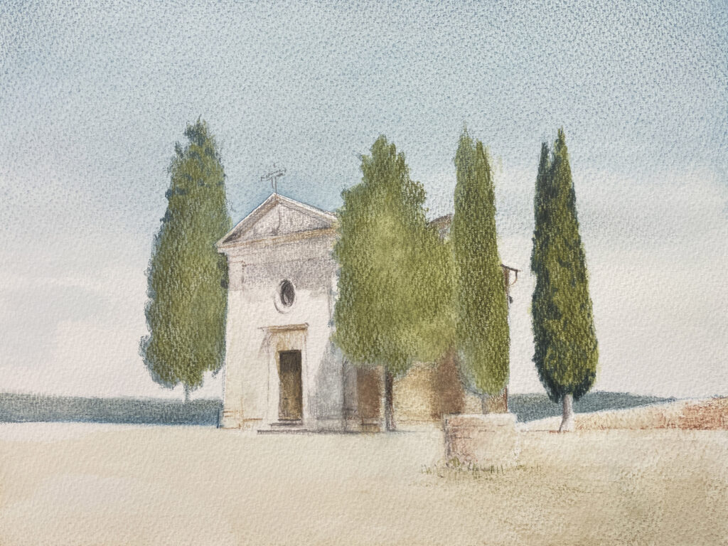
Step 3 -Mid-Tones
What I did: It’s now time to start building the value contrast and enriching the colors. I start here with a layer of dry pencil on the sky, using Ocean Blue and Slate Green. I’m focusing on achieving a mid-tone for the trees, which I achieve using Ivy and Shadow to darken the trees
What I Learned: A slightly damp brush works well to suggest the texture in the trees. When wet, the colors in these pencils get richer, but it can be a delicate balance to effectively load the brush with water. Whereas large areas, like the sky, are best served by using more water, textured areas are best achieved by using less.

Step 4 – Final Touches
What I did: Final touches are achieved by darkening the shadows in the trees and adding colors and textures to the foreground. I used a dry application of Shadow toad form and texture to the trees. Three colors were used in the foreground – Sage, Russet, and Cocoa – using loose brushwork and a mixture of drybrush and wet brush techniques.
What I Learned: As I activate a dry layer with a wet brush, I do so with a gentile touch, which allows the tooth of the paper to remain visible. This helps to avoid overworking the foreground and suggest, rather than describe, the texture.

Need Help?
If you’re stuck, here are some additional photos from the process that may help break it down into smaller, more manageable bits.


Graphitint on watercolor paper is a compelling pairing. The resulting image has a compelling light quality and texture, but I need to better understand the colors and how to layer them effectively. I enjoy building layers of hatch marks and details on top of the colored washes and look forward to working further with these materials!

Meet the Artist
Scott Maier is an artist and a content contributor to artistsnetwork.com. He’s also the author of the instructional art book See, Think, Draw: An Easy Guide for Realistic Drawing and Beyond.





Graphitint pencils by Derwent are a staple for my daily sketchbook practice. I really appreciate that the lot does not contain pure primaries, only 24 subtle colours that allow me recreate the ancient marble of the Classical world which in turn gives me freedom to add stronger colours down the road. My aim is to recreate the beauties of an historic period that produced stunningly beautiful structures.
Graphitint pencils by Derwent are a staple for my daily sketchbook practice. I really aporeciate that the lot does not contain pure primaries, only 24 subtle colours that allow me recreate the ancient marble of the Classical world which in turn gives me freedom to add stronger colours down the road. My aim is to recreate the beauties of an historic period that produced stunningly beautiful structures.