Get Lit! Directional Lighting for Dramatic Paintings

Use value effectively to achieve strong lighting and dramatic color.
By Kathleen S. Giles

I’ve been painting with and teaching watercolor for years, and it’s obvious that artists want their work to be eye-catching regardless of subject matter. For me, a strong pattern of lights and darks, or value, is a fundamental ingredient for creating work that jumps off the paper and grabs the viewer’s attention. Follow along as I share three examples of directional lighting and how I use value to achieve light-filled works.

Strong Directional Lighting
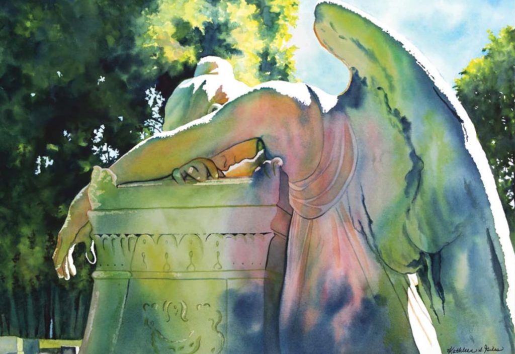
When a subject is in strong directional light—whether backlit, sidelit or toplit—the values that help to define shape are present in both shadow and highlight form. For a backlit scene, the object is in shadow and surrounded by a highlight. Light hitting the side of an object creates shadows that show that object’s contours. Light that shines from directly above an object creates highlights on its top contours and medium or dark values on its vertical surfaces.
The subject matter determines where the lighting should be placed. To create directional lighting indoors, I use umbrella lights with 120-volt warm lightbulbs. A pendant light in my kitchen is an additional go-to lighting option for still life subjects. I set a small table on my countertop to bring the object up close and snap away. The goal is to have enough directional lighting so that a flash isn’t required, because it will blow out the shadows I want to be able to see and paint.
When photographing outside, I rely on early- and late-day sun, because the sun’s angle throws longer, more colorful shadows. I’ve found that noonday sun is generally too stark and tends to flatten objects.

The Color of Light
When there’s an absence of distinct directional lighting, color changes can be used in place of value. For example, if the background is similar in value to the object in the middle ground, I make the background a different, or complementary, color. That will visually separate the objects and add depth. Tip: Be aware of color intensity, not just light and dark. Using more paint and less water adds vibrancy without necessarily darkening the value.
To create the look of light, I use transparent staining watercolors from a variety of brands, and I don’t use any tube gray or black in my palette. I make all my neutral colors, grays and blacks by mixing complements. For example, yellow and pink are mixed for orange. To deepen or dull the orange, I add a touch of blue. The ratio of the colors to each other within the mixture determines if the color leans toward orange or blue; this is called a triad. All grays are made of triads.
I use different paints to do different jobs. For example, French ultramarine doesn’t have the same intensity as indanthrene blue or phthalo blue, but it does granulate. Knowing which colors mix to make the richest darks is helpful when I’m trying to get accurate values for a subject.
Backlighting

In Man With the Yellow Cup (above), the light is coming from behind the subject. It was a challenge to make his body appear as a seamless shape with many color and value changes. Wet-into-wet and wet-on-dry painting allowed me to control my hard and soft edges.
To create the illusion of light, the color is a brighter orange toward the light side of the face. As the shadow on the skin moves away from the light source, it becomes cooler and darker. I used a mixture of indanthrene blue and perylene maroon for the darkest areas of the skin. Adding blue to the reddish perylene dulled and darkened the color.
I dried and rewet the paper to apply successive layers of color. The only way to apply paint without leaving interior lines is to work on wet paper. I used strong transparent yellow on or near the highlights. In this painting, it caused the cup to appear to ‘glow.’

Sidelighting
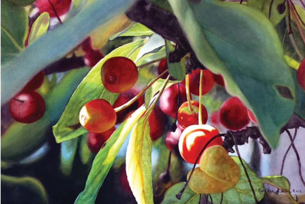
I always carry a camera with me, and when the sun is out, I find myself looking for my next big inspiration. For a series, such as my crab apple paintings, I’ll take about 100 photos and then review them on my computer screen.
As soon as I saw the reference photo for Crab Apple World (above), I knew it had the makings of a special painting because only the side-sunlit apple was in focus. The whites appear on the left side of the crab apple or very close to it. The brightest red is in the same area, with lots of yellow used as an underpainting.
All of the other colors in the painting are dulled down by their color complement, while the shapes are blurred with soft edges. Any highlights from the photo that were in the outer corners were grayed down or eliminated.
Toplighting
One of the easiest ways to depict drama is by shining an overhead light directly onto a subject and using a black background behind it.
If the background is black, the objects in the foreground need to be comprised of whites and mid-tone values. If the objects in the foreground are too dark, they’ll blend with the background and look flat.
Complementary colors can be used for both color harmony and drama. A dark background should be made from the colors that were used in the painting. One of my darkest darks is made by mixing permanent rose with phthalo green.
Demo: Sidelighting the Figure

I began with a reference photo (above) that featured a woman sidelit from the left. I determined that the windows in the background added interest, but were too light. Meanwhile, the dark values on the apron and those surrounding the figure were too dark and flat.

Step 1
I made a pencil drawing, straightening the windows and simplifying the background, and then applied masking.

Step 2
I applied a yellow wash over the areas I wanted to consist of darker values.

Step 3
I laid blue and pink washes into the yellow underpainting while it was still wet. Notice how the value pattern is beginning to take shape.

Step 4 (Detail)
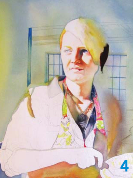
I left the left side of the face light as I started to paint the skin tone. I placed several of the darkest darks in the hair and neck as a value guide.

Step 5
I added the darks to the background, taking care to make them lighter than the shadowed parts of the hair. I then removed the masking in the background. The windows behind the head look like a highlight when surrounded by darks.

Step 6 (Detail)
I flooded more color over the hard mask lines and the window to deepen the color and reduce any background highlights.

Step 7
I continued to develop the mid-value colors on the apron, hair and clothing. The pinks, bright yellows and reds appear only on the figure. I painted the blouse and apron lighter and more vibrantly than they looked in the reference photo.

Final Step
I placed the most value contrast in and around the center of interest. The necklace and surrounding colors lead the eye from the face to the hand to the dessert in Serving Lemon Pie (watercolor on paper, 30 x 22).
Experiment with these three types of directional lighting to determine what works best for the statement you want to achieve with your painting.
About the Artist
New York artist Kathleen S. Giles is a signature member of the National Watercolor Society, Watercolor USA Honor Society, and the Pennsylvania and Niagara Frontier watercolor societies. Her art, defined by strong values and colorful shadows, has earned national recognition. She teaches in the United States and Canada.
This article originally appeared in Watercolor Artist magazine. For more great watercolor techniques and inspiration, subscribe!


Have a technical question?
Contact UsJoin the Conversation!