Shake Up Your Watercolors with Toned Paper
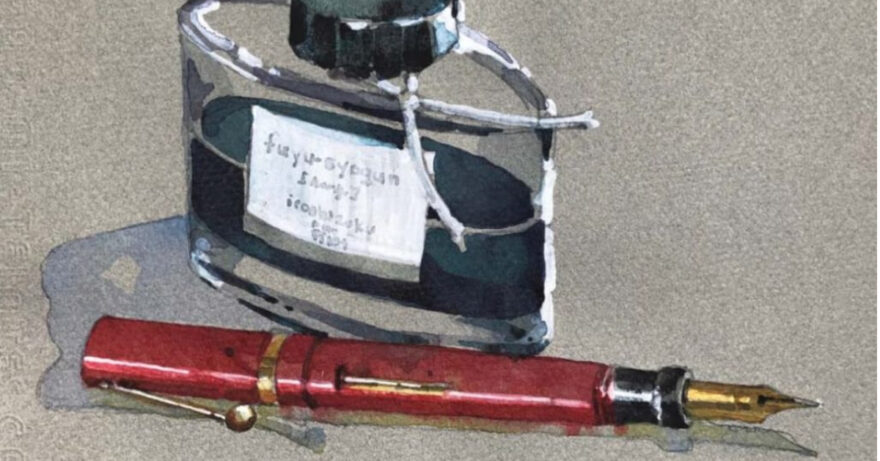
Try painting on a toned surface for a fresh take on creativity
This article contains affiliate links that help us earn a small commission from purchases — at no additional cost to you. We are grateful for your support.
Sometimes you need to mix it up to take your work to a new level, and experimenting with new materials is a great way to push yourself to work in a new and exciting way. Here artist Brenda Swenson shares how changing from white to toned paper can unlock new ways of working.
Break the Rules
Give yourself permission to try something new, push the boundaries of what you know or break a few so-called rules. I’ve found that the best teacher is exploration, which is why I like to sketch and paint on a variety of papers and surfaces: white and toned (colored), slick and rough, inexpensive and expensive.
Some of the papers I’ve used aren’t intended for watercolor— or art. So why use them? Because I’m curious. I’ve found that using the same technique or materials again and again bores me, and boredom is the kiss of death for creativity. When I take a subject I’ve done before and paint it on a different surface, the experience is exciting. Why? Because I’m responding to the surface. It’s like having a new dance partner; you learn to respond to that person’s lead.
Playing with Layers
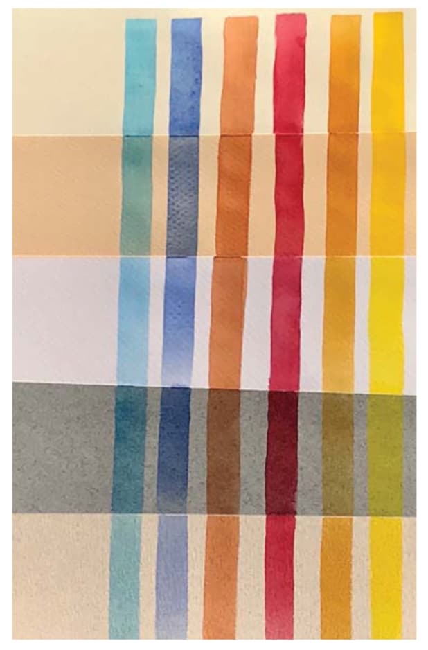
Lately, I’ve been enamored of using a variety of toned paper for my transparent watercolor work. When I paint on a toned surface using transparent watercolor, the underlying paper shows through, creating color harmony. As a result, it’s similar to how an underpainting impacts paint color.
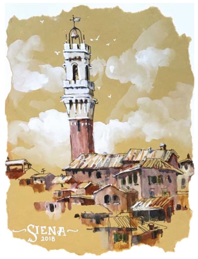
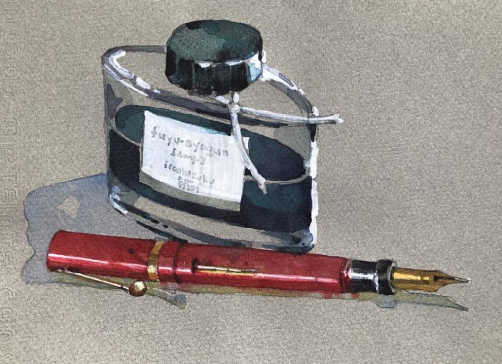
If the paper has a warm tone (yellow or cream), the paint color will appear warmer, as in Siena, Italy (above). However, if the surface has a cool tone (blue or gray), the paint color will appear cooler, as in Pen & Ink (top).
Exploring Toned Paper
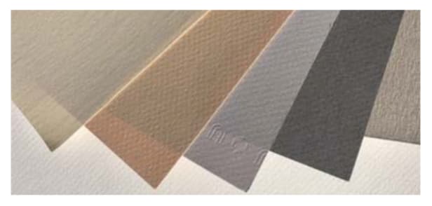
Working on a surface other than white watercolor-approved paper leads to fresh exploration. I’ve had wonderful results, for example, with Canson Mi-Teintes pastel paper; it’s easy to work with and responds similarly to 90-lb. cold-pressed watercolor paper. The paper is 98-lb. with a 66 percent rag content, and it’s gelatin sized, making it sturdy. To prevent the paper from buckling, I use less water than I would when working on Arches 140-lb. cold-pressed watercolor paper. The paper has two distinct surfaces—one side has a fine grain; the other is honeycomb textured—and comes in 50 pulp-dyed, light-resistant tones. I prefer the textured side, especially in the cream and gray tones.
Problem-Solving Gets Results
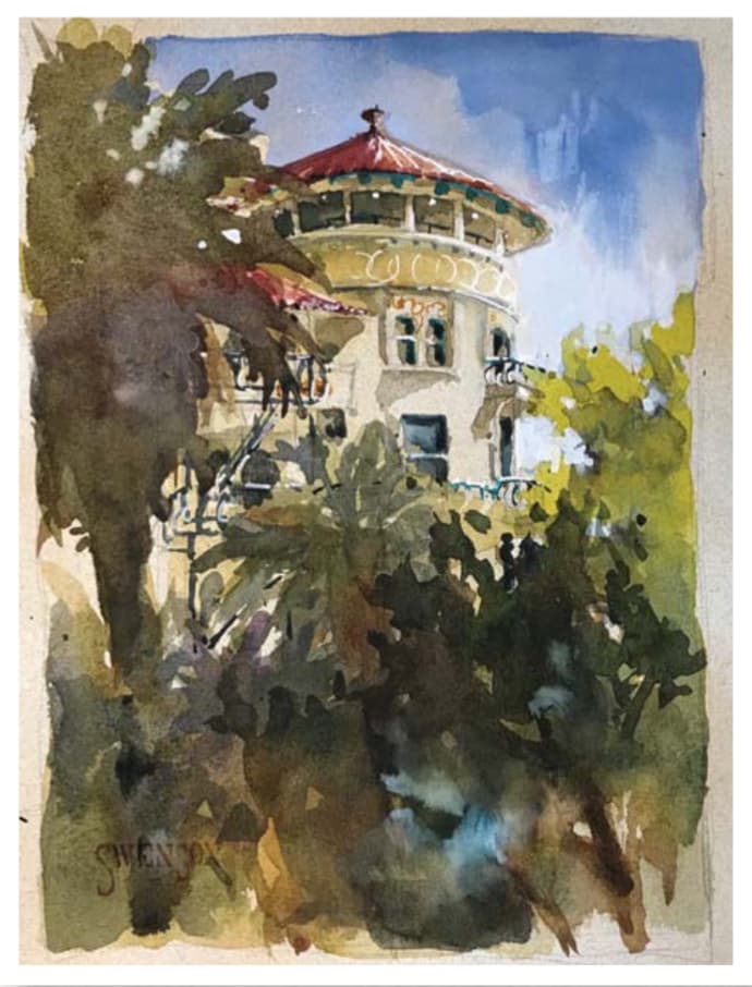
Some papers can be a little more challenging, but are worth exploring. I discovered Papeterie Saint-Armand’s Canal gray 150-lb. 10×14-inch pad in an art supply store in Santa Fe, N.M. It’s machine-made and comprised of recycled materials—cotton off-cuts from clothing manufacturers—as well as linen, flax straw, jute and sisal. Available in pads or 22×20-inch sheets, it comes in 20 different grades and colors, including cream, gray, beige and black.
I love the gray tone and sturdy surface of the pad I purchased, but my first attempt with the paper wasn’t impressive. The colors appeared flat because they soaked deep into the paper, and the paper remained damp too long, making it difficult to get dark darks. I had to dig deep to figure out what approach the paper liked. First, I had to use less water with the paint. Next, I used the tone of the paper as the mid-value. To create whites, I relied on gouache and white pens. To make dark darks, I turned to Platinum carbon black ink applied with an inexpensive brush. I ended up loving the paper. This kind of problem-solving keeps my work fresh and my creativity thriving.
Breaking with Convention
Not all surfaces have to come from an art supply store; I’ve had great success exploring unconventional papers, too. For example, last fall, while teaching a workshop in Tuscany, I noticed that the majority of cafés featured the same color of placemat— a beautiful, warm raw sienna in an approximately 90-lb. smooth texture. During lunch, I often drew on the provided placemat, and I was surprised that the pen glided so well on the surface and that the ink didn’t bleed. The final morning in Siena, I did a quick sketch on it and found that it worked. When I returned home, I pasted it on the last page of my sketchbook.
Adding White to Watercolor
When working on a toned paper, things change drastically. Most notably, we have to rely on white paint or markers for the whites, since the painting surface isn’t white. I imagine a few watercolorists are raising their brows at the thought of adding white to their work. My feeling, though, is that if white was good enough for Sargent, Homer and Turner, then it’s good enough for me. Here are a few of my go-to implements when adding white or dimension to toned paper.
Exploring Gouache, Markers and Pens
What’s the difference between using gouache and a marker/pen on toned paper? The white PITT by Faber-Castell has a chunky tip and covers well. For fine lines, I use a water-based, extra-fine Sharpie. Both of these are waterproof when dry, which enables me to glaze over white highlights without lifting the white.
Gouache, on the other hand, remains water soluble. Painting over an area with gouache will lift up. I keep white gouache (not Chinese white) in a small container with a screw-on lid; it would dry out in a palette. When I want a soft, diffused white in a sky, I often use gouache. I add the white into a wet passage of blue and move it around as necessary with a brush. It also works for covering a large area, but I rarely use it to mix with other colors.
Demo: Go for Gray
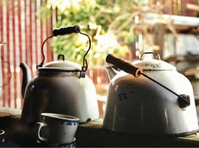
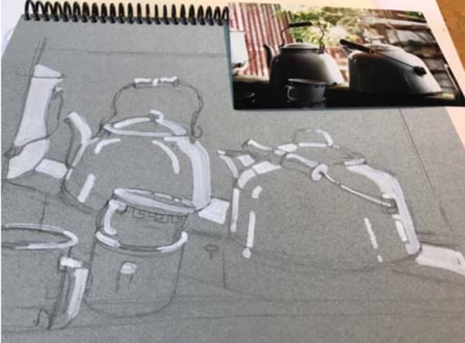
Because this antique shop still life featured mostly cool undertones, I knew I could rely on Canson Mi-Teintes steel gray paper for the main subject—the kettles and cups. I drew the reference scene on Canson Mi-Teintes gray paper using a 2B pencil. Next, I defined the highlights using the Faber-Castell PITT artists pen in white.
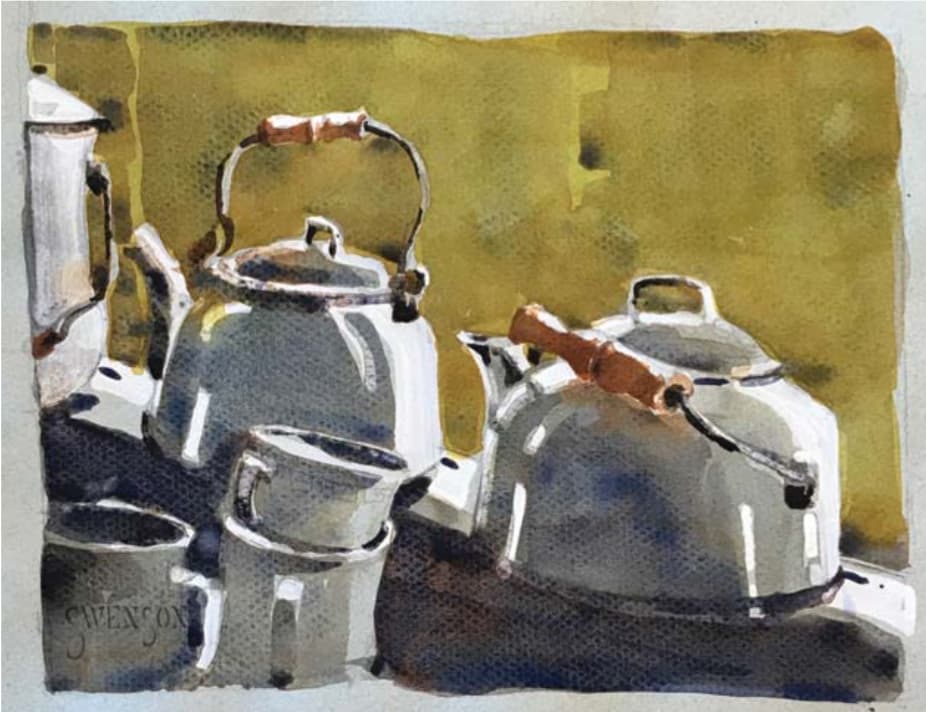
Shake up your own watercolor practice by experimenting with toned paper. It will challenge your creativity in the best ways possible.
About the Artist
Artist and workshop teacher Brenda Swenson (swensonsart.net) is the author of Keeping a Watercolor Sketchbook and Steps to Success in Watercolor (Artist’s Library). Her paintings and sketches have also been featured in a number of competition art books, including Splash 11, 12, 14 and 19 (North Light Books), as well as many art magazines. An active participant in the arts community, Swenson has served on the boards of directors for both National Watercolor Society and Watercolor West.
This article first appeared in Watercolor Artist, April 2019 issue. Check out the rest of the issue for more great tips on taking your paintings to the next level!







I would like to try the Saint Armand paper. Anyone know where it is sold in the US?
Hi Janet! I found some on Amazon: https://amzn.to/3mi23n8
PAPER gorgeous PAPER…never gets old. Thank you.
These paintings are delightful and creative. I have drawings on tone paper and really enjoyed working on it and now I want to try painting on my toned papers too. Thanks for the wonderful article!
This is a very interesting article, especially about the St. Armand Canal paper. I had bought some from their factory in Montreal and was very disappointed in how it performed. Now I will have another try.