Must-Have Colors of 7 Master Painters

Many artists turn to certain colors time and time again when painting. Whether your signature color is ultramarine blue, or you prefer an array of paint colors but only by a certain brand, finding those pigments that just seem to fit perfectly with your paint aesthetic can be like winning the lottery.
Below, seven watercolor artists share their favorite paint colors to work with. Maybe one of these following selections will spark a new favorite addition to your own painting palette. Enjoy!
Jonathan Frank
Daniel Smith | Rose of Ultramarine
“Rose of Ultramarine from Daniel Smith is versatile, lightfast and gorgeous. Therefore, I quickly discovered its multitasking abilities. It’s particularly useful as a layering color in that it can increase the depth and complexity of cool and dark areas, as well as add texture and rich tonal ranges to warmer areas. I feel that it greatly contributes to the overall richness and luminosity that I strive for in my work.” — Jonathan Frank
Birgit O’Connor
Winsor & Newton | French Ultramarine Blue
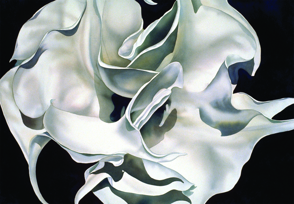
“French ultramarine blue is one of my go-to paint colors when mixing greens, deep purples or when I want a nice brown- to blue-gray. Because of its granulating properties, mixing it creates a static-like charge called flocculation. I personally like the effect it gives, but if you personally don’t, hit the drying color with a hairdryer to flatten it. I particularly like the blue-gray combinations of French ultramarine blue when mixed with burnt umber or burnt sienna. As the mixes dry, they leave nice textured transitions, especially in white flowers.” — Birgit O’Connor
Carolyn Lord
Winsor & Newton | Cobalts
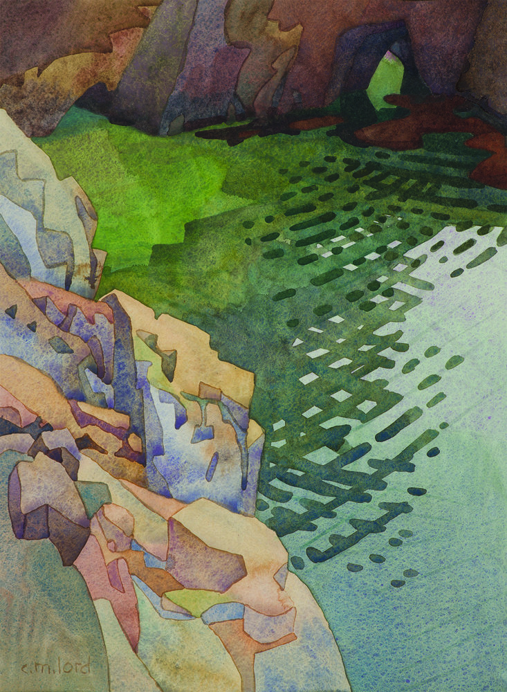
“The non-staining qualities of Winsor & Newton’s cobalt watercolor paints —cobalt blue, cobalt green, aureolin (cobalt yellow) and cobalt violet — are perfect for establishing the composition and forms that undergird the fluid application of paint. After mixing the desired color and value on my palette, I apply it to the paper. Then, the pigments suspended in water will settle into the divots of the watercolor paper as it dries. These divots create the impressionistic flecks of color that are characteristic of my work and are especially visible in the lighter value passages of my paintings.” — Carolyn Lord
Betsy Dillard Stroud
Holbein | Grey of Grey
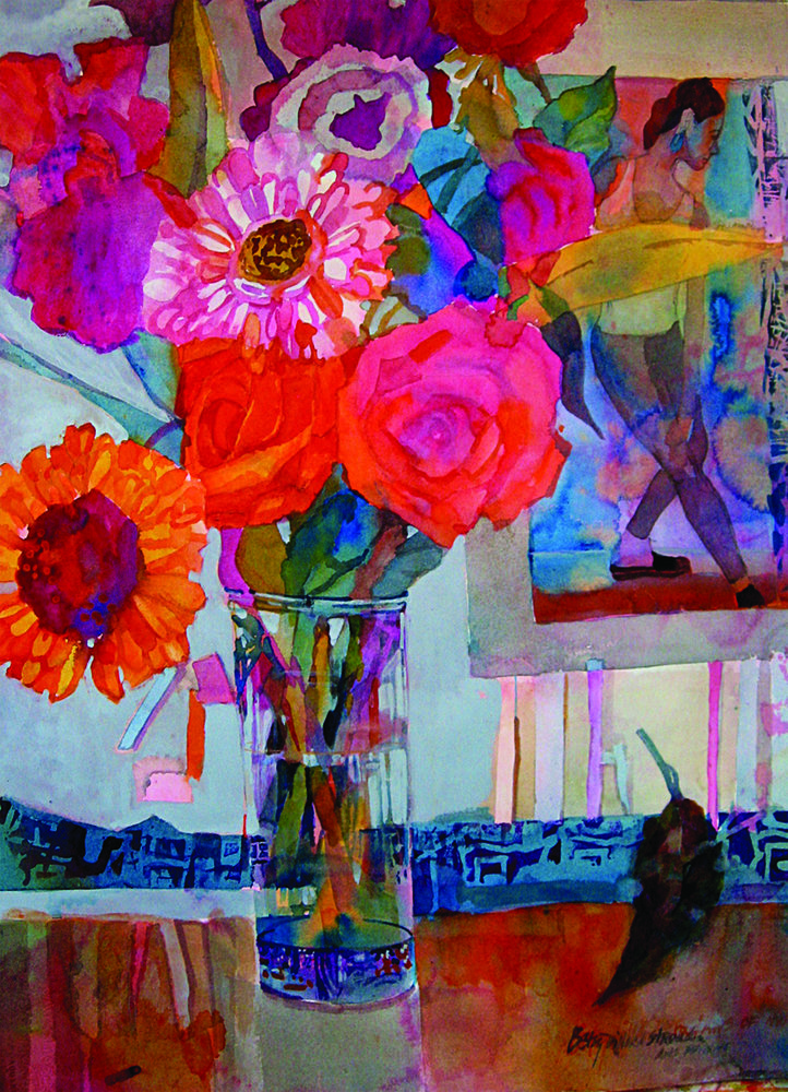
“Although Holbein’s Grey of Grey is a watercolor, it has opaque qualities and comes in handy when I want to contrast the lovely transparency of watercolor with a flat opacity. In La Danse (below), for example, the background is a soft, beautiful mixture of all the transparent colors used in the painting. Still, it didn’t provide enough contrast. Grey of Grey came to my rescue as I used it to connect a vase with the background. It can be mixed with other paints as well, both transparent and opaque, for elusive colors that make a subtle rather than a bold statement.” — Betsy Dillard Stroud
Jean Grastorf
Phthalo Blue
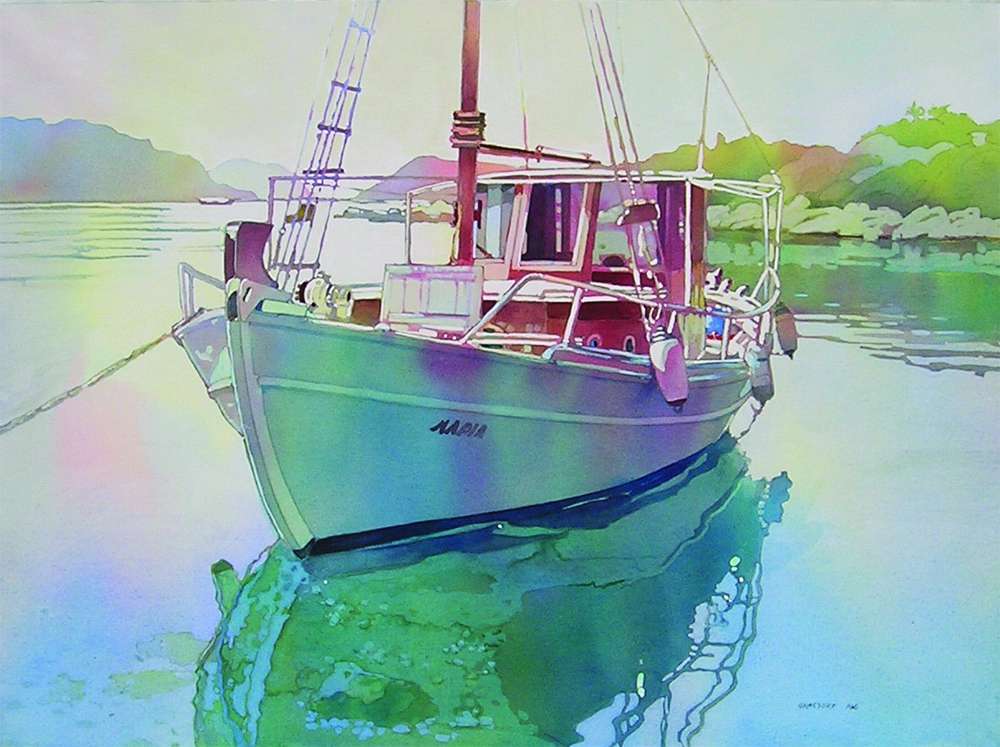
“The color that I rely on is phthalo blue. When I pour my paints (my usual technique), it’s the strongest and coolest color of my triad. I combine it with a yellow, such as Hansa, and the red is red rose deep. Phthalo blue can be thinned to make beautiful transparent hues in a variety of colors. When it’s used thickly, almost out of the tube, it’s the source of my darkest values. Always dependable, it combines well with alizarin crimson, phthalo green and indigo for a range of colorful darks. It goes into suspension well and pours easily. In Reflections (below), even the warms have phthalo blue in them but in a weaker mixture. The dark details are partially phthalo with an added warm pigment (alizarin crimson and phthalo green).” — Jean Grastorf
Taylor Ikin
American Journey | Taylor’s Flamingo Pink
“Almost every painting I create gets a fling of Taylor’s Flamingo Pink before I sign it. I created this color quite by accident, when I was teaching my adult class. I dragged my 2-inch flat brush through my large, heavily loaded palette, tossed it on the surface and there was a new color: pink! I had the sense to make marks on a clean sheet of YUPO to preserve the integrity of the paint. Then I set about working backward to find the makeup of this yummy color.
“I use American Journey Paints by Cheap Joe’s; so naturally, I contacted them and sent a sample color. The rest is history. When it was time to name the color, Cheap Joe’s decided to introduce it as Taylor’s Flamingo Pink! I’m forever amazed how a few snaps of a brush loaded with this color can produce that finishing touch that contributes life and energy to my work.” — Taylor Ilkin
Stephen Quiller
Jack Richeson | Naples Yellow
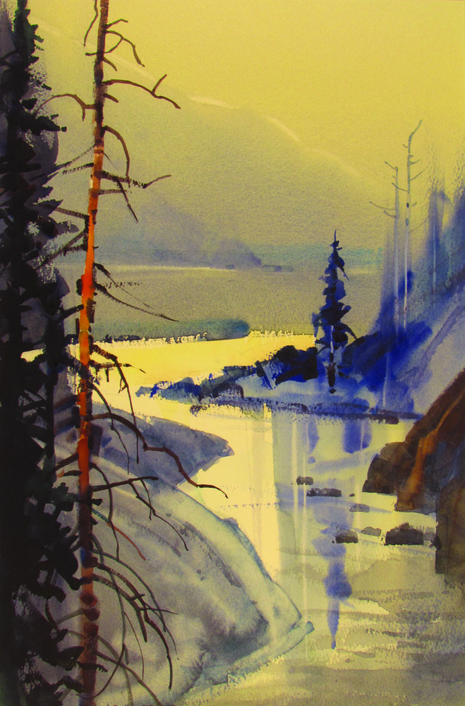
“Wherever I’m painting (Ireland, Italy, the mountains of Colorado), I cannot do without Naples yellow. I can add a touch of cadmium red-orange to it and make a soft, fresh yellow-orange. I can add a touch of permanent green light and make a soft, fresh yellow-green. In my painting, View From My Studio, A Soft Day, Naples yellow has been used by itself in the central water area. In the upper distant range and sky, I neutralized it with its complement, ultramarine violet. This created the soft hazy atmosphere.
“In the warm orange snag (the dead standing tree), I added the yellow to cadmium red-orange and cadmium orange to give the tree substance and body. Using Naples yellow not only allows me to get the color I’m after but, more importantly, it also helps me capture the mood, atmosphere and substance that I feel in nature.” — Stephen Quiller

This article contains affiliate links that help us earn a small commission from purchases — at no additional cost to you. We are grateful for your support.








Thank you for an exceptional article. Jean Grastorf’s watercolor painting, “Reflections” was a stunning use of phthalo blue. Every artist’s work and recommendations were most appreciated.
I’ve just been enjoying what colours other artists use. Its not a ‘you must’ use these colours – the two comments above are just so annoying and negative. Open your eyes and be amazed.
Aureole has has been shown time and time again to be fugitive. It should never be used. This only perpetuates the idea that watercolor paintings fade.
Grey or Grey? A fugitive black, PBk1, mixed with Titanium Dioxide. Not recommended to be use in tints or washes IMOSHO Sorry, but this pigment won’t make my “Must have list”.