Building Balance: How Basic Design Principles and Visual Arrangements Create Harmony
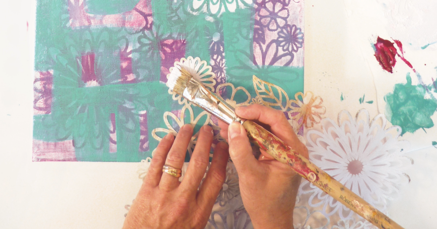
When I’m creating a painting, I’m always trying to establish harmony. I would say it’s the one thing I’m after and it’s the hardest to explain. As I paint, I use basic design principles and work the visual arrangement of elements to create harmony.
Subscribe to Artists Magazine now so you don’t miss any great art instruction, inspiration, and articles like this one.
Basic Design Principles
✓
Balance
✓
Rhythm and Repetition
✓
Emphasis
✓
Proportion
✓
Contrast
If your finished painting lacks unity or harmony, check the basic design principles list to see where you’ve gone off track. Ask yourself these questions: Does the painting need more balance, a focal point or emphasis? Is there enough repetition to create rhythm? Are the proportions right—are there contrasting proportion or scale?
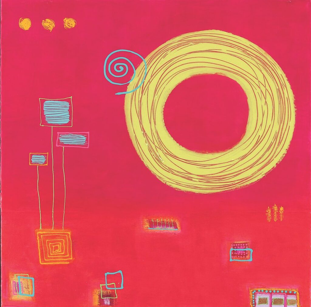
In Tilt a Whirl 3, I used contrast, rhythm and repetition to create unity and harmony. Here’s how I did it: The large yellow circle was the dominant element that I used to create emphasis. It’s clearly the focal point of the painting. I unified the painting by repeating smaller circular elements. The smaller yellow circles and smallest teal dots in the bottom, right corner created unity as well as added interest and movement.
Proportion came into play again when I changed the sizes of the rectangular shapes. I repeated them with just enough variation in size to create interest, but not so different that they disrupted the harmony. When I’m working with shapes, I usually repeat them and vary the sizes. In this way I’m using contrast in proportion (or scale) and repetition. This leads to a rhythm in the painting, very much like a piece of music. Setting up a pleasing rhythm with just enough variation to give interest leads to harmony and unity in the painting.
Harmony and unity go hand in hand. In music, when notes harmonize they create a sound that is pleasing to the ear. If one note is sharp or flat, it’s obvious and disrupts the harmony and we notice it. A good piece of music, though, will have some sharps and flats that create an interesting composition. Too many similar notes without any variation would be boring.
The same idea can be applied to visual art. You can interrupt the harmony of a piece by adding elements that are slightly disruptive. This creates interest and makes for a lively composition. It’s also a good way to create emphasis or a focal point.
Steps to Create Harmony
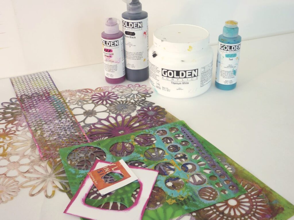
Step 1: Keep the colors simple. Limiting my palette to quinacridone magenta, teal, titanium white and bone black created unity in this piece. I had a wide range of tints and shades with which to work.
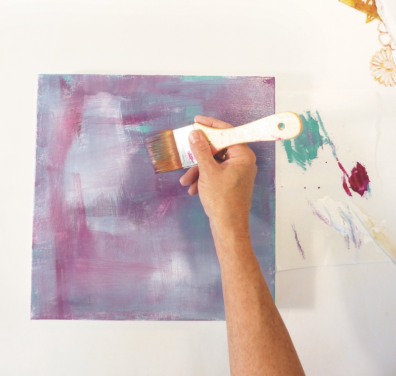
Step 2: Lay down a background with just the four colors in the limited palette and let it dry.
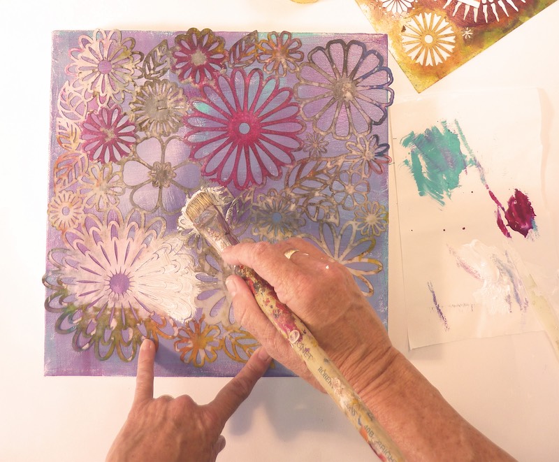
Step 3: Use stencils to repeatedly paint the same shape and similar shapes.
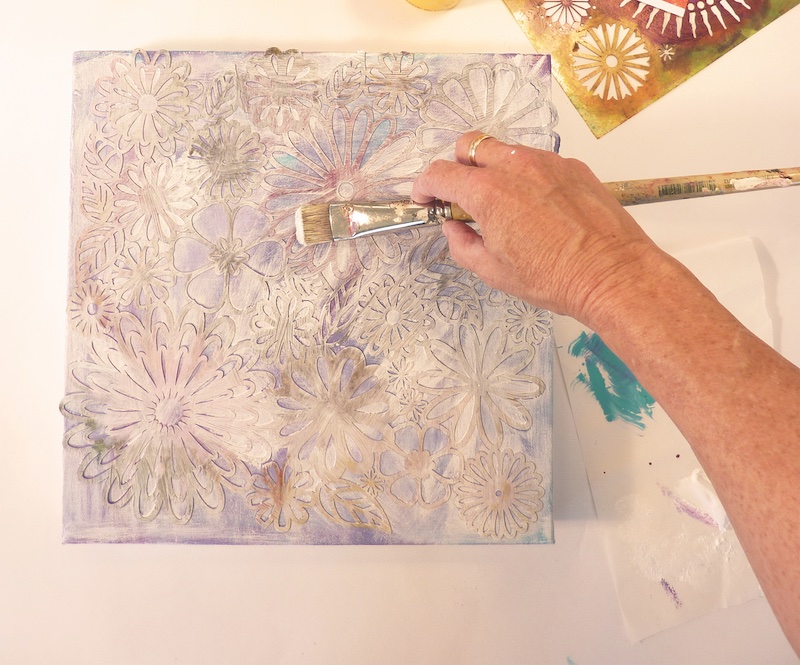
Step 4: This shows the entire flower stencil laid over the canvas. By layering similar stencil shapes, I maintained unity.
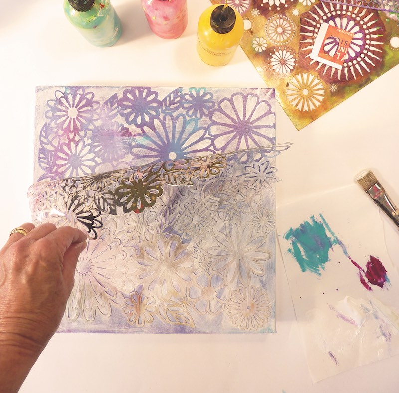
Step 5: Having covered the canvas with titanium white, the negative shapes have been blocked out. Let this layer dry.
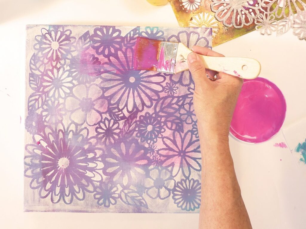
Step 6: Mix quinacridone magenta with polymer medium gloss in a 1:10 ratio to make a transparent glaze. Cover the entire canvas with this unifying glaze. Let the glaze dry thoroughly.
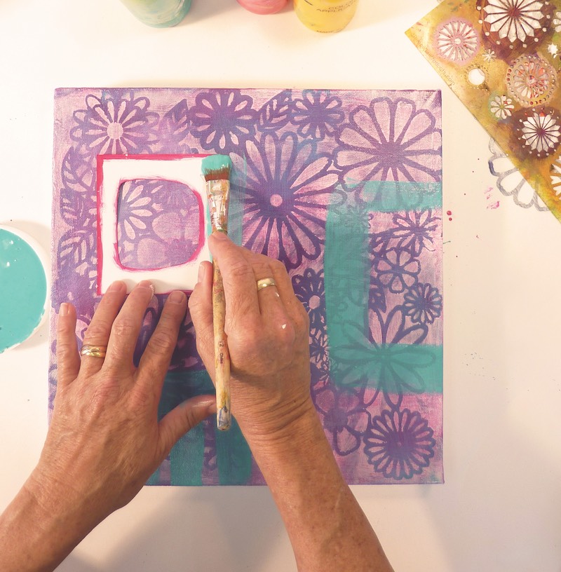
Step 7: Create a semi-transparent glaze by mixing teal and polymer medium gloss in a 1:1 ratio. Paint in positive shapes, leaving some of the underpainting showing through. In this layer, I chose to use hand-cut stencils of geometric shapes in contrast to the overall floral pattern of the stencil. The geometric shapes provided interest and contrast to the piece without detracting from the overall harmony.
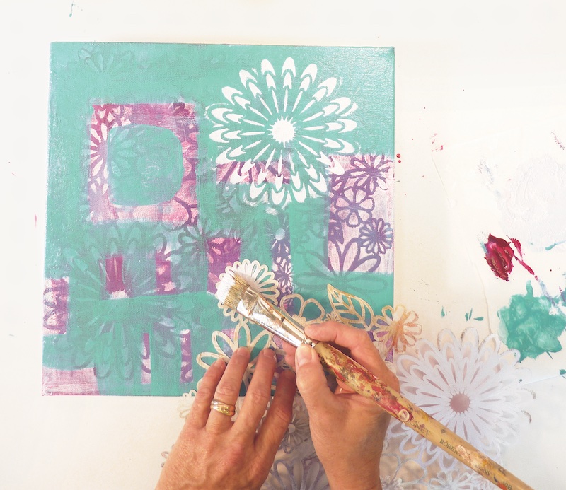
Step 8: Using the same floral stencil, mix a pink tint with 1 part quinacridone magenta and 10 parts titanium white. Using parts of the stencil, create one dominant focal point and two or three subordinate focal points. Let this layer dry.
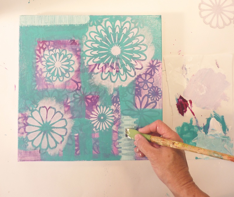
Step 9: Add interest by painting free-form geometric shapes and add texture by scraping through the wet paint. Let dry.
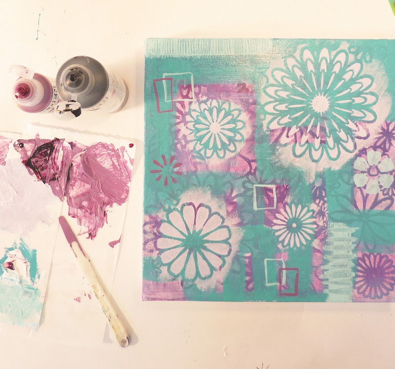
Step 10: Mix quinacridone magenta, bone black and titanium white to create several shades and tints. Add interest by painting in geometric shapes in thin lines that relate to the layer painted in teal. Change the relative proportions of the geometric shapes so that they’re smaller or larger than the teal layer.
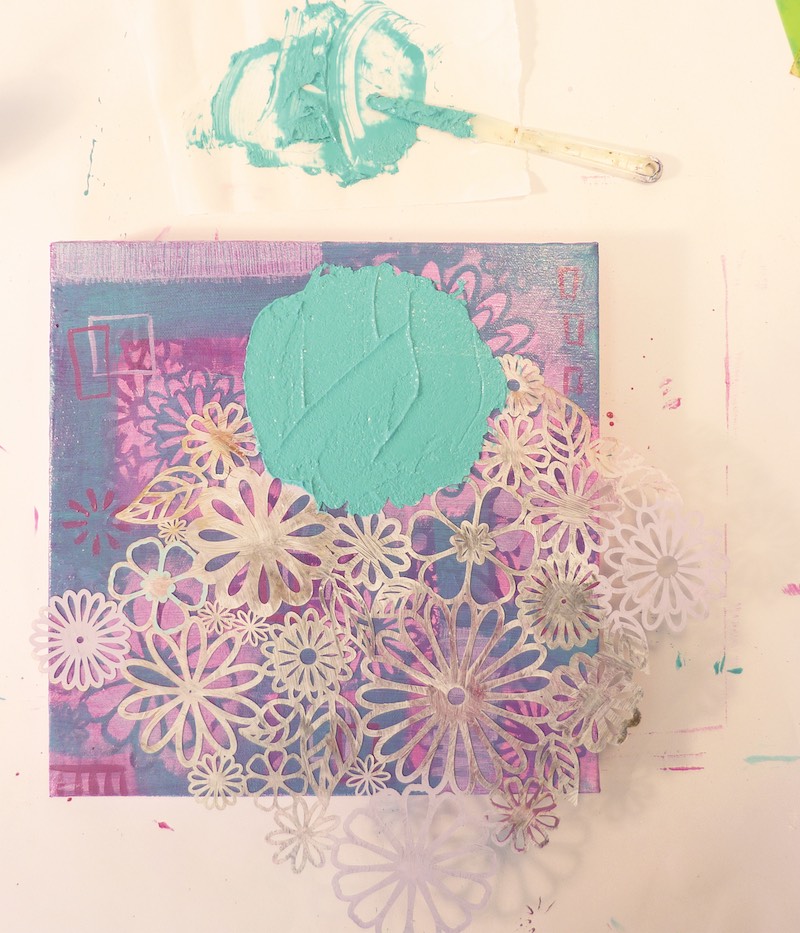
Step 11: Add another glaze of transparent quinacridone magenta. Let dry. Add another set of stencil shapes. This time, when using the stencil, add glass bead gel fluid teal to create texture.

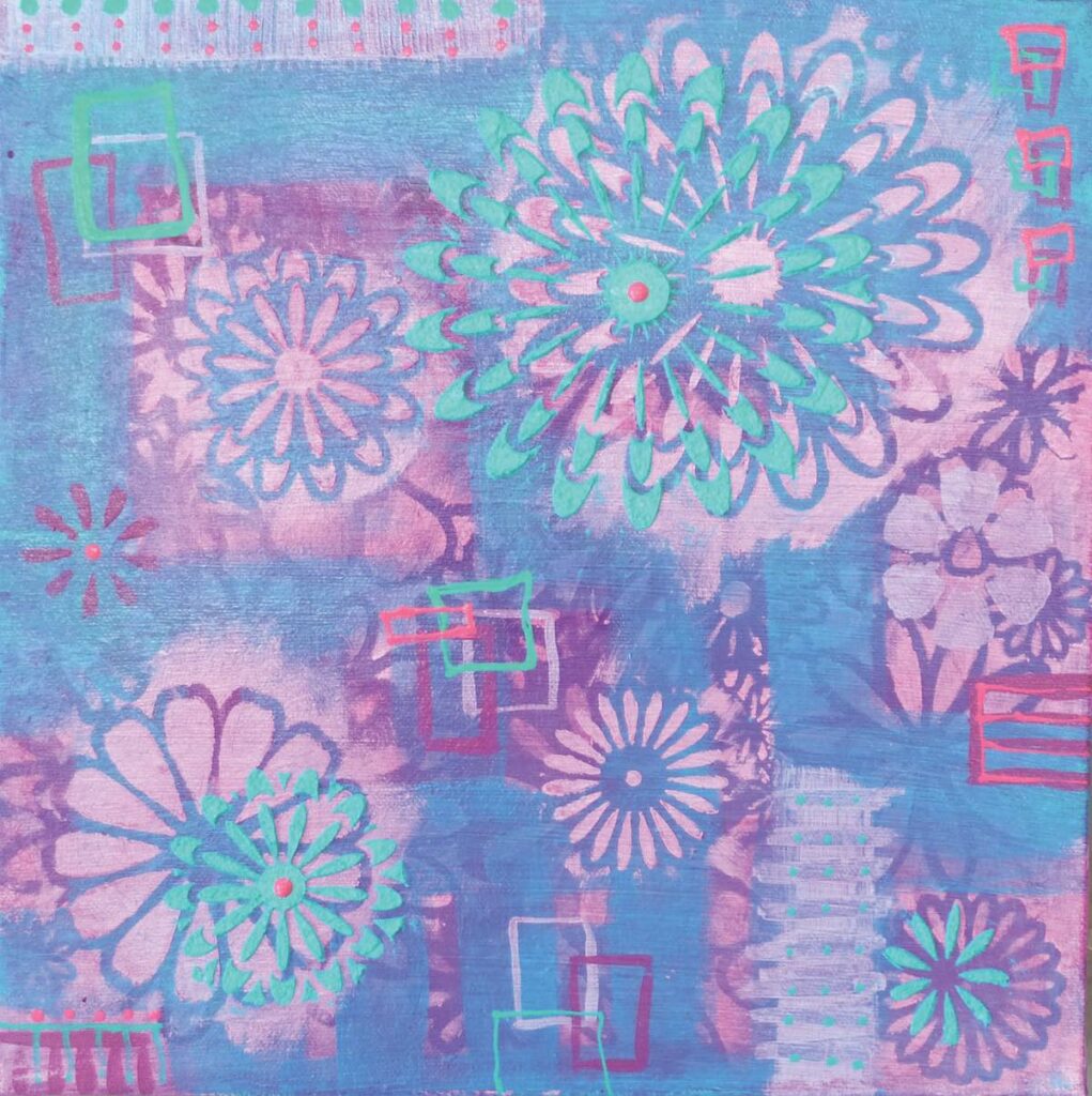
Step 12: Use one large shape from the stencil to create a dominant focal point. I added small details to finish Spring Fling (acrylic on canvas, 12×12). The harmony and unity have been maintained by repeating the same colors and shapes. Using different proportions of the same shapes created variation which, in turn, created interest. Remember to keep it simple: a couple of colors, one or two shapes, add a dash of contrast for variety, and you’ve got it.
This article first appeared in Acrylic Artist in Spring 2016. It was updated and published on Artists Network in August 2023
Meet the Artist
Tesia Blackburn has been a working artist in the San Francisco Bay area for more than 25 years. She is a revered workshop instructor and the author of Acrylic Painting With Passion.
Enjoying this article? Sign up for our newsletter!
From Our Shop






Join the Conversation!