How to Paint Abstract Art: Develop a Composition

In this step-by-step demonstration, artist Molly Herman mixes mediums to develop an abstract composition with a rhythmic process of mark-making.
By Molly Herman
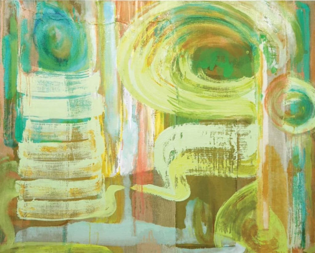
“All art constantly aspires to the condition of music” —Walter Pater
My compositional process is to make a mark (a movement or gesture in paint), then to look and respond with another colorful movement. At some point, this rhythm of working picks up to a pace that feels automatic, spontaneous and intuitive. This “flow” is the state I seek while painting — and hope to share in some way with the viewer. As you learn how to paint abstract art, aim for a rhythmic, responsive flow.
The Artist’s Toolkit
- SURFACE: linen on a 40×50 stretcher and sized with matte medium (canvas or wood panel are also good)
- ACRYLIC PAINTS: Guerra Paint & Pigment water-soluble acrylic pigments (aka “pigment dispersion”) mixed with Guerra’s Silica Flat or Matte medium to create paint in these colors: anthra golden yellow, phthalo blue-green, titanium white
- OIL PAINTS: Williamsburg rose madder, alizarin crimson , Indian yellow, titanium white, sap green, phthalo green, phthalo blue, indigo blue
- ACRYLIC MEDIUM: matte medium
- OIL MEDIUM: linseed oil
- MARK MAKERS: house-painting brush, fan brush, palette knife, rags or paper towels
- COLLAGE MATERIALS: various scraps, leftover ends, and fabrics
Step 1: Surface
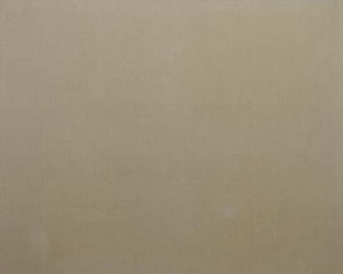
Selecting a surface is the start of any painting. From this decision all other choices follow. I chose a heavyweight linen for its color and texture. Next, I sized it with matte medium, which seals the fabric while preserving its natural color. Determining the scale of the stretcher for the painting is also an important decision. I prefer surfaces that are 40 to 60 inches on a side; those dimensions relate to my gestural scale, which tends toward large, sweeping brushstrokes.
Step 2: Collage
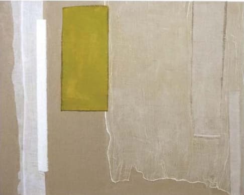
I often use saved ends and scraps from past paintings and projects for collage elements in a new composition. As you learn how to paint abstract art, try beginning a painting with collage to break up the clean, even surface. This step can add a literal shift in the ground for the subsequent paint layers. For this painting I selected scraps based on color as well as texture. I used translucent cheesecloth, white gauze, white velvet and olive-green linen. I played with their arrangement until I found a visual rhythm in the composition. Then I affixed the pieces to the linen with matte medium, which dries clear.
Step 3: Acrylic on Collage
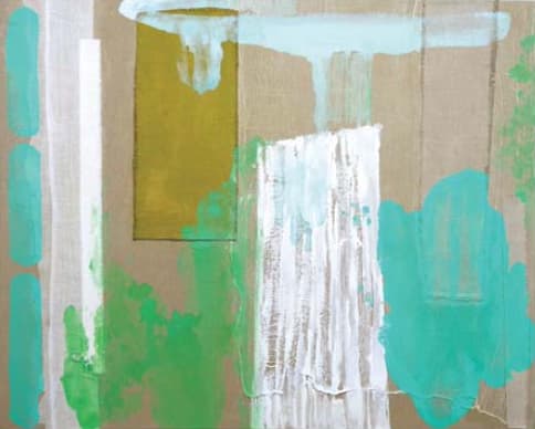
I added acrylic paint in response to the various collaged pieces. For example, I chose to paint a broad stroke in white overlapping the loose weave of the cheesecloth. This emphasized the cheesecloth’s texture. Also, the white put the cheesecloth, the background linen and the velvet strip to the left into a chromatic relationship. Then I decided to add colors that were analogous (near each other on the color wheel) to the raw-linen surface and the olive-green, collaged linen. With green and blue acrylic I mixed yellow-green, mint green, aqua and pale blue.
Step 4: Poured Acrylic
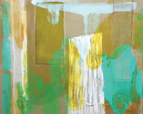
Studying my work, I saw I was composing on either vertical or horizontal planes. Sometimes, to keep the painting open, I disrupt this type of fixed order. I decided to pour paint to create a flow within the composition. Pouring can seem risky as you learn how to paint abstract art, but it can also be exciting. Spontaneous movement keeps the life in a work. I mixed a large quantity of anthra golden yellow in a deli container, adding equal parts water and Silica flat medium for a soupy consistency. This transparent color “glows” differently over different surfaces and colors.
Step 5: Gestural Strokes in Oil
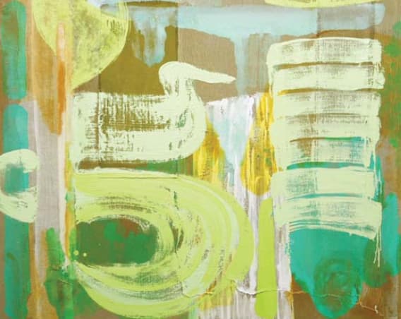
After the poured paint had stained in and fully dried, I was ready to load a big brush with thick, juicy oil paint. I mixed a pale green that has a lot of white in it so that I could keep the light values and provide a contrast with the darker greens washed into the linen ground. I wanted the pale color to visually sit on top of the surface and move forward. With a large housepainter brush, I stacked repetitive, staccato movements. In another area I mimicked the sweeping, gestural flow of the poured paint. I then added more yellow into the green mixture and worked wet-into-wet to give dimension to the flat, pale green.
Step 6: Turn and Reflect
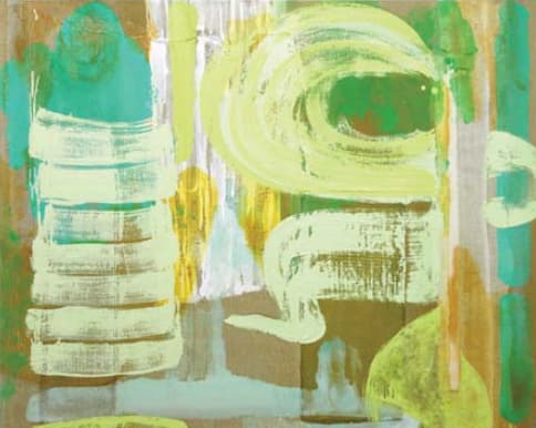
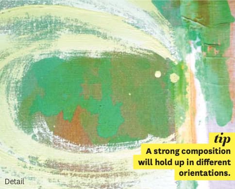
At this point, many opposing elements were competing for attention. I had thick and thin paint, different layered surfaces and textures, a range of green, blue and yellowish hues, and light and dark values. This was a good place to pause and reflect on where the painting had arrived and what possibilities might yet come. Often, after staring at a painting in a specific orientation, seeing it in a fresh way becomes difficult. To counteract this, I turned the painting upside down. I considered the edges as well as the path the eye moves along within the composition.
Step 7: Complementary Color
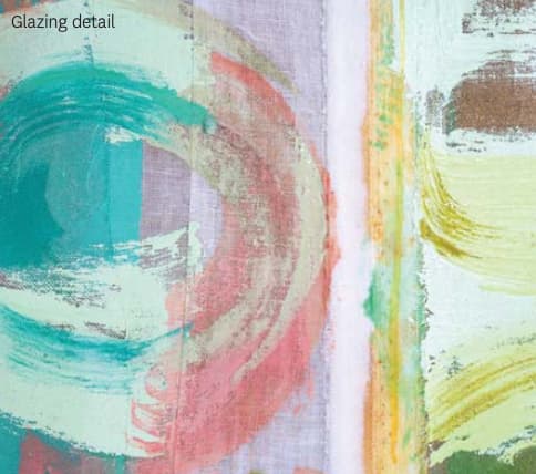
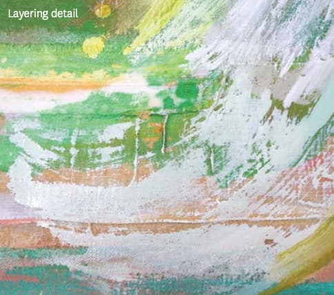
After some consideration, I decided to add areas of reds and pinks to complement the greens. I used several application methods — glazing, layering and painting wet-into-wet. Adding complementary colors to a generally analogous color scheme can insert an unexpected spark or an accent. This can bring all the colors together in a harmonious way. Also note that the mixture of green and red created a neutral color, not unlike the color of the raw linen. In this way, the colors began to “weave.”
Step 8: Turn and Reflect (Again)
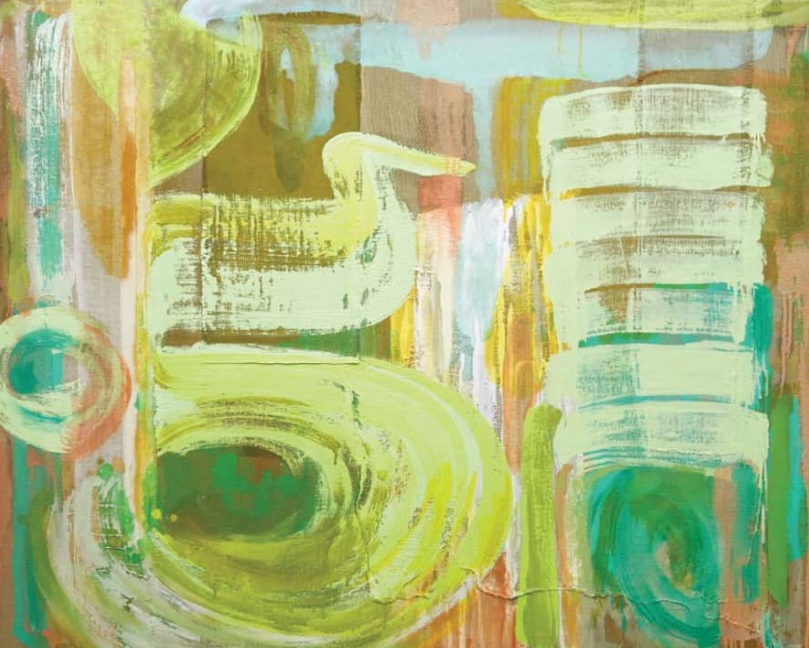
After applying the complementary color, I again paused to contemplate the composition as a whole. Strong, sinuous brushstrokes suggested an image of a duck in the middle of the composition. I keep an eye out for this sort of thing. I try not to purposefully or accidentally paint an image of something imagined or illustrative. The appearance of a duck seemed less apparent when I turned the picture. However, I noticed a division just left of the middle, separating the painting into two sections, one curvy, one stacked. Wanting to connect these two areas, I hit on the notion of mirroring the sinuous stroke that pointed toward the middle. The mirrored strokes don’t quite touch.
Step 9: Drips

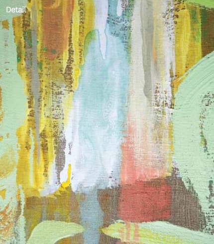
I explored whether some dripped marks should be edited out — or added — for a sense of anchoring and gravity appropriate to the orientation of the work I’d settled on.
FINAL: Titling the Work

Naming a work comes last for me — usually, after looking at the painting and free-associating. (My former teacher, Jake Berthot, said, “Every painting is a Rorschach test.”) I try to find a name that directs the viewer’s attention into the painting and touches on an idea that expands on the painting’s physicality. I chose the title Field Equations because I like its suggestion of Einstein’s theory of relativity, which, in turn, nods to the relativity of color. I’ve used the word “field” in other titles, and the term holds many associations. It can refer to a landscape as well as the “field of imagining” in an abstract picture plane. The word also signals a historical connection I feel between my work and that of Color Field artists.
As you learn how to paint abstract art, work through all the steps of developing a composition and reflecting along the way on what’s working.
About the Artist
MOLLY HERMAN earned her BFA from Virginia Commonwealth University and her MFA from the School of Visual Art. She’s a professor of painting and color theory at Parsons School of Design, where she has taught since 2000. Herman has exhibited her paintings in numerous national and international venues. For more information and to see more of her work, visit mollyherman.com.
A version of this article first appeared in Artists Magazine.





I work in acrylics only and have been so hesitant to incorporate oils into my pieces; now I want to try it! So what if it takes a year to dry!!! This is a beautiful piece; thank you for sharing.