Color Triads That Make My Day
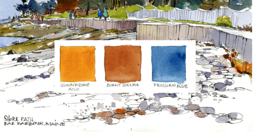
Learn how I use a limited palette to evoke a particular day, time, season, place or mood—or all of these.
By Shari Blaukopf
This article originally appeared in the July/August issue of Artists Magazine. Read the full issue HERE.
My full travel palette holds more than 20 pigments, but on most sketching days, I’ll dip into just three or four. That’s really all I need, because a limited palette provides nearly unlimited chromatic and expressive possibilities.
Since I often return to the same places again and again when I’m urban sketching, narrowing my palette is a great way to experiment with color combinations that create mood and atmosphere. The same scene will look markedly different depending on the time of day, the season, and the weather—and will look just as different depending on the color triad I choose.
The added benefit of a limited palette is, of course, enhanced color harmony. True, these colors may not always reflect exactly what I’m seeing but, then, I’m not taking photos. Instead, I’m trying to create unified, dynamic sketches that evoke a specific time and place. And when that happens, it really makes my day.
Here are a few of my favorite limited palette sketches and the pigments I used to paint them.
Limit the Color
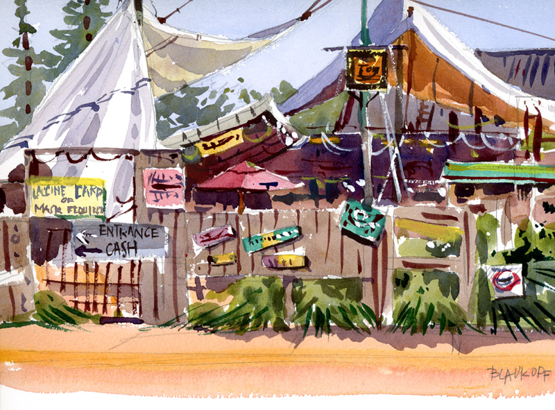
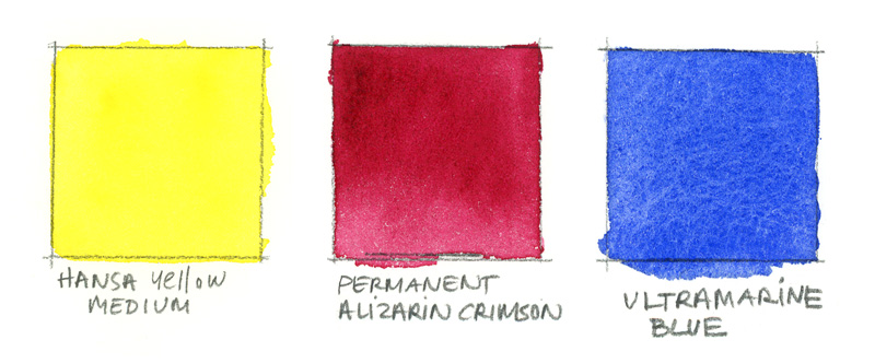
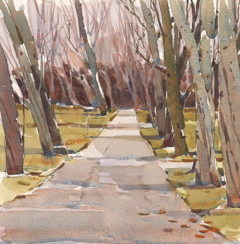
In most cases, my go-to limited palette is a primary triad of Hansa yellow medium, permanent alizarin crimson and ultramarine blue. Depending on how I combine them, I can create bright secondary colors, glowing neutrals, and powerful darks. This trio was perfect for capturing the sun-blasted, ramshackle entrance to Tom’s Burned Down Café, on Madeline Island, Wis. I added touches of cobalt green for the signage.

Let One Color Dominate
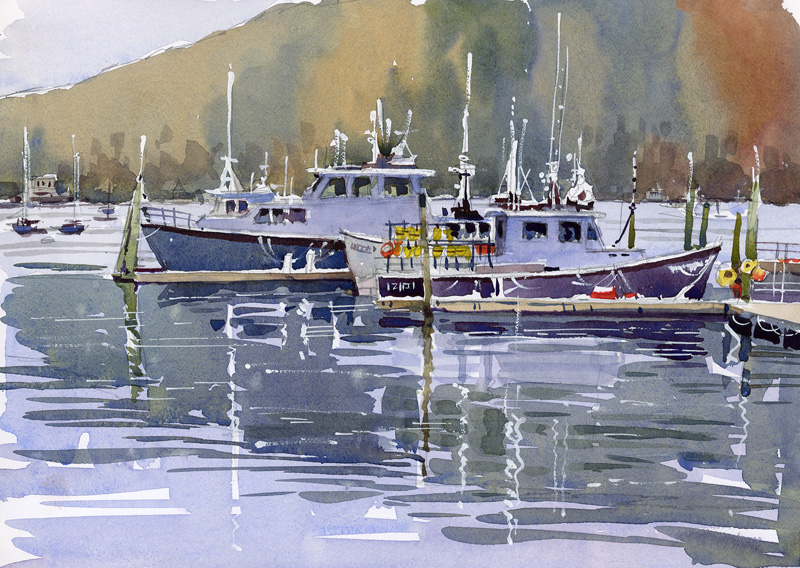
To evoke the soft morning light in Acadia Park’s Northeast Harbor, I used weaker-strength washes of Hansa yellow medium, permanent alizarin crimson and ultramarine blue. Then, to establish the scene’s maritime mood, I painted the resulting purplish-blue washes across two-thirds of the composition so the viewer focuses on the water instead of the distant wall of trees.

Modulate the Color Intensity
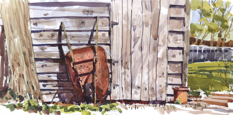
By modulating color intensity and values, I used the same triad of primary colors—Hansa yellow medium, permanent alizarin crimson and ultramarine blue—to create this sun-filled garden scene as I had for the previous two paintings. A diluted wash of these primaries gave me a soft, warm neutral for the wood planks of the shed. Used full strength, the same colors created a rich dark for the shadow areas.
Experiment With New Triads
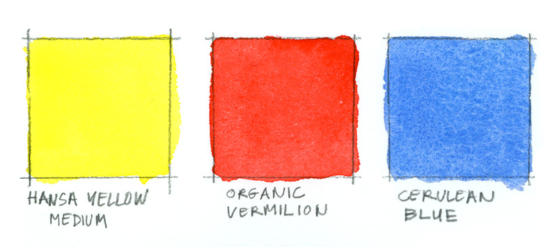
An overcast fall day in Montreal can seem drained of all color, so in this sketch, I tried out a new triad. I dipped into my lightest blue—cerulean—to establish an overall softness and added a warm red—organic vermilion—for a pinkish tone that balances the surrounding grays and light greens, which I created by adding a dab of Hansa yellow medium to the blue. This color triad gave me the quiet color harmony I’d hoped for.
Choose Seasonal Colors
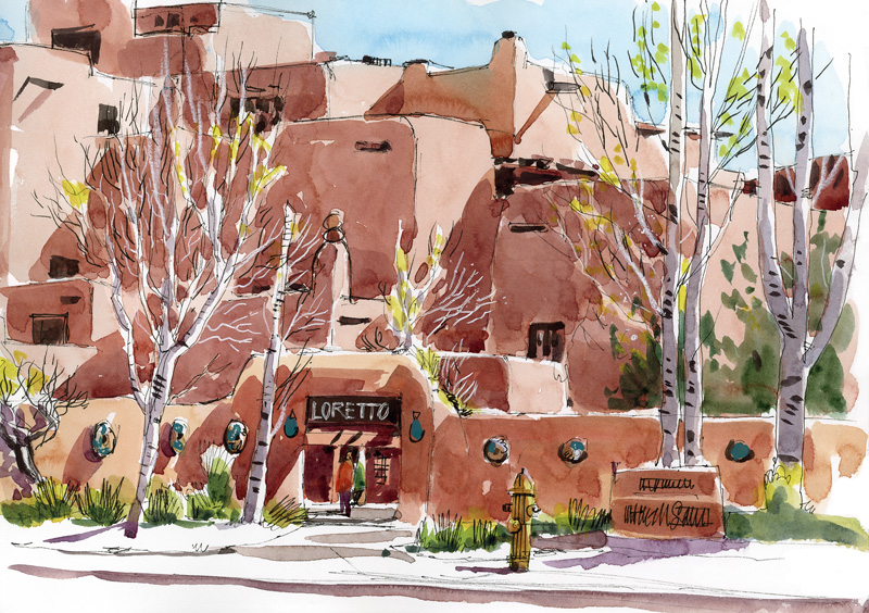
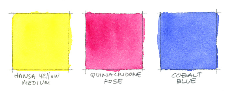
A spring morning is the best time to catch the sun’s delicate light on the stacked cube walls of the Inn and Spa at Loretto, in Santa Fe. Although the adobe architecture of my favorite New Mexico city can seem rather brownish at times, I used primary colors—Hansa yellow medium, quinacridone rose and a touch of cobalt blue in the shadows—to mix washes for this springtime scene. Hansa yellow medium is perfect for adding the bright pops of green in the newly budding trees.
Tone Down the Color Intensity in Winter
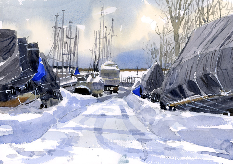
In my part of the world, winter calls for an even narrower choice of colors. In fact, that’s when I shift my focus from color to lights and darks. On this frosty winter morning in Montreal, I underpainted a warm wash of raw sienna to give the sky a bit of glow, but then painted the shrouded boats entirely with cobalt blue and lunar black. I added a bit of burnt sienna for contrast and warmth.

Add Bright Spots for Variety
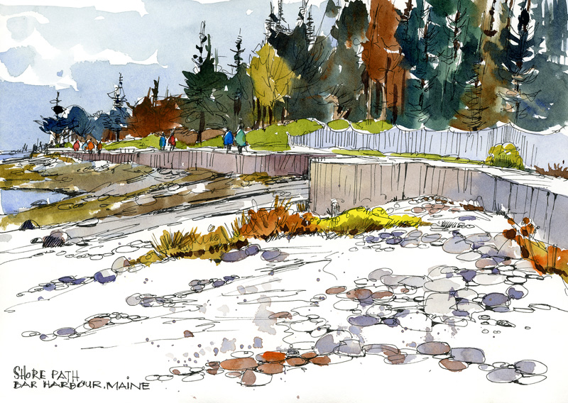
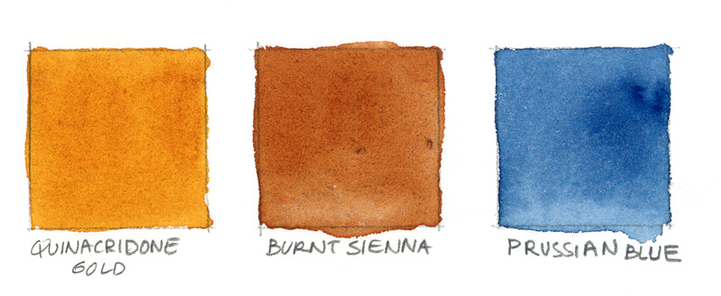
To capture the brilliant autumn colors in Bar Harbor, Maine, I began with my favorite intensely warm yellow—quinacridone gold—and then added Prussian blue and burnt sienna to complete the triad. The gold and blue combine to make the juiciest dark greens. At the end of a sketch, I often add in some spots of bright color for sparkle. In this case, I used a little Hansa yellow medium for the bright beach vegetation, as well as touches of turquoise blue and cadmium red for the passersby.
About the Artist
Shari Blaukopf is a Montreal-based painter, teacher, author and art blogger who loves to travel and share her love of urban sketching. You can find her online courses at Learn.ShariBlaukopf.com. Her book, The Urban Sketching Handbook: Working With Color, is available in bookstores and online retailers everywhere.
From Our Shop






Join the Conversation!