Create a Collage Landscape Inspired by Robert Rauschenberg
Taking Risks in Your Art
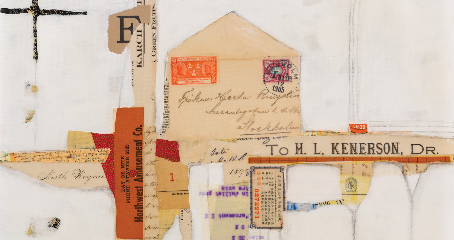
Robert Rauschenberg was an artist who liked to challenge conventional artistic thinking. He used found materials to create collages and assemblages that both astounded and confounded those who saw them. Inspired by his artistic vision and style, we will create a collage landscape with found papers and other materials, along with acrylic paint.
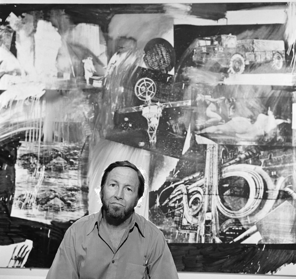
Using found objects, paper and other items in artwork not only adds texture, interest and wonder to our work, it brings the viewer’s imagination into play. Rauschenberg tells us not to be afraid to put something down at random in a piece of art. Taking risks is part of making art, along with problem solving and uncertainty. Find a way to make it work. Now, let’s create a collage landscape with this in mind. Materials you’ll need:
- Dark acrylic paint or gesso (I used black gesso)
- Paintbrush(es)
- Stretched canvas or cradled board (I used an 11 x 14 board)
- Fluid acrylic paints (I used Golden® Artist Colors in Naples Yellow Hue and Titan Buff)
- Palette knife, wide blade, or spatula
- Found papers, a variety, including neutrals and a few colored pieces
- Matte medium and/or soft gel matte medium
- Heavy-body acrylic paint, your choice of colors (I used Golden Titanium White)
- Pencil, #2
- Optional: Golden Gel Topcoat with Ultra Violet Light Stabilizers, semi-gloss or heavy gel medium
Creating a Collage Landscape, Step-by-Step
1. Prepare the Substrate
Paint the substrate with a dark color. I chose black gesso, but other good choices are Golden Artist Colors acrylic paint in Prussian Blue Hue, Dioxazine Purple, or even Pyrrole Red or Red Oxide. Don’t forget to paint the sides of the substrate as well, if applicable. Allow to dry.
2. Mix in Lighter Colors
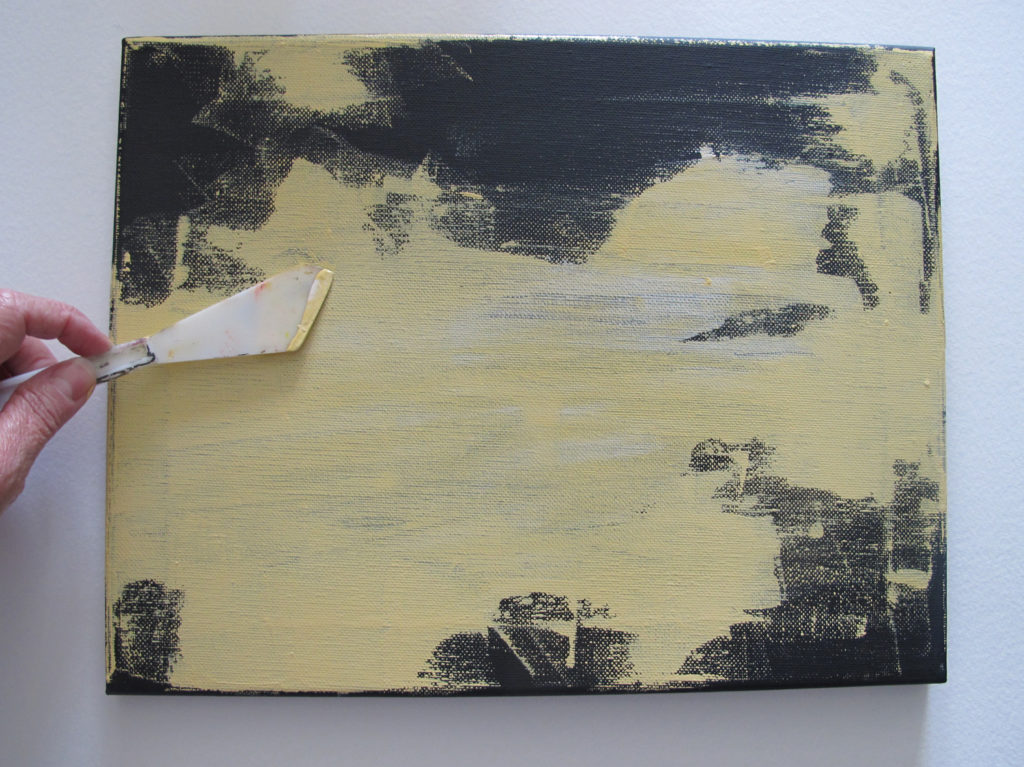
Place a few drops of fluid acrylic paint on the substrate in a couple of light colors. Scrape the paint over the surface, using a palette knife. I used Titan Buff and Naples Yellow Hue. Allow the colors to mix as you scrape. But be sure to leave some dark areas showing. Allow to dry.
3. Gather Paper Scraps
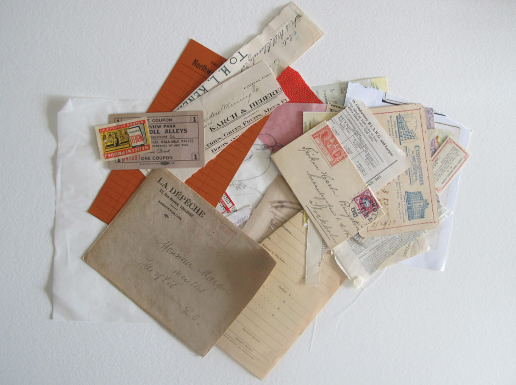
Grab an assortment of both neutral and colored scraps of paper and ephemera. I found a few pieces in my scrap box with bright orange and red on them, and decided to keep the color scheme neutral except for those two colors.
4. Start Working on Your Collage
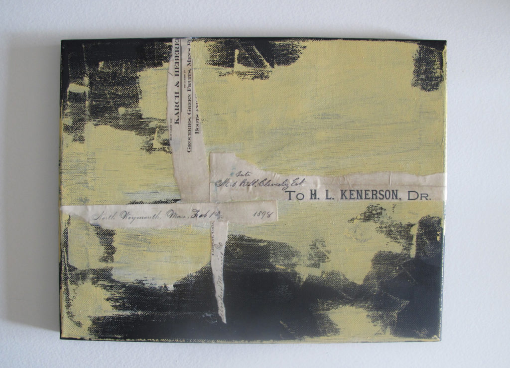
Using a cruciform shape, which is a loosely formed intersection of a vertical line and a horizontal line, begin your collage. The “T” or cross formation of this shape allows you to easily build a collage in more than one direction. I decided to work with my surface in landscape (horizontal) orientation. This process also works in portrait orientation (vertical). The cruciform acts as the anchor for placement of all of the other elements. Use matte medium to adhere any lightweight materials and gel medium to attach heavier elements.
5. Set Your Foundation
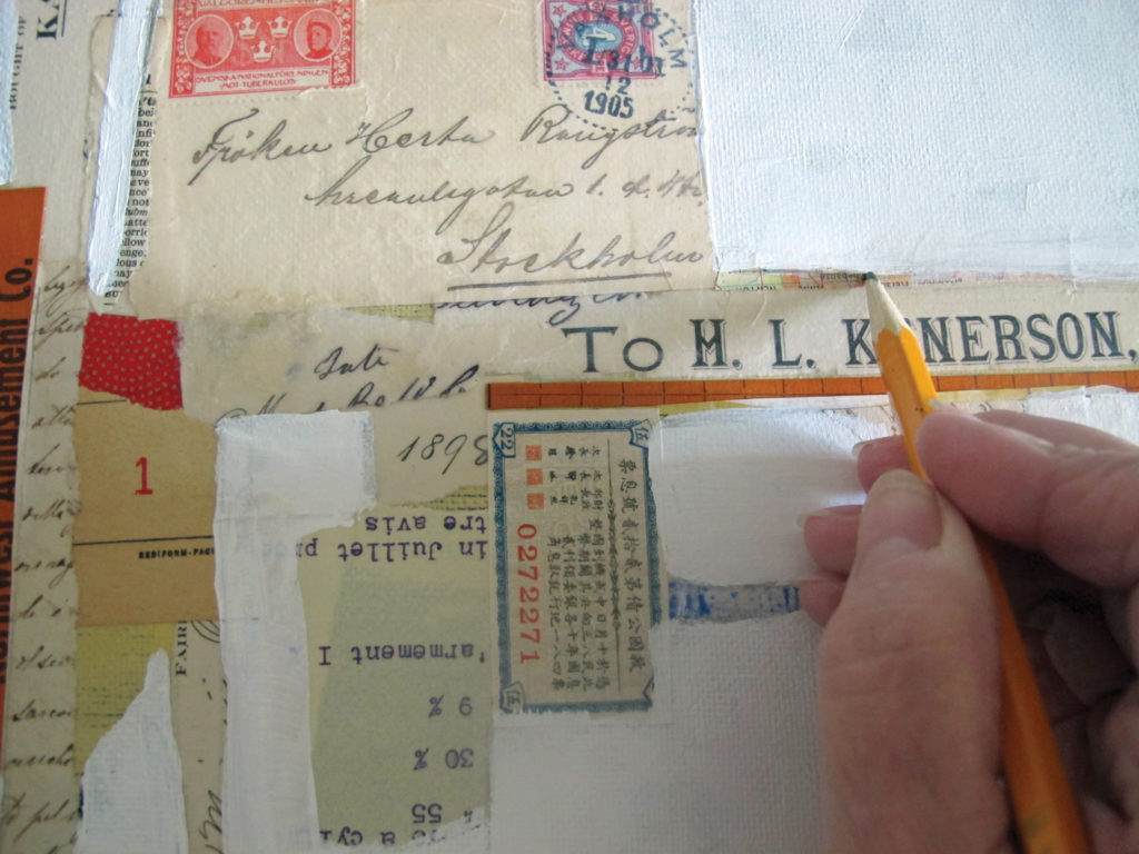
Place the largest collage element closest to the intersection of the “T” of the cruciform. The intersection of these original two pieces forms the core of the focal image. Think of these cruciform pieces as the foundation of a building. Every piece grows the building in both width and height with the intersection being the main entrance. Each of the other items you add serves to counterbalance the entire composition. If your first piece is wide and tall, you could then place a long narrow piece perpendicular to the original cruciform pieces. Add additional pieces both horizontally and vertically until you are satisfied with the structure. When working with neutral and colored elements, place the colors throughout the composition. This encourages the viewer to follow the color around the composition. Allow to dry.
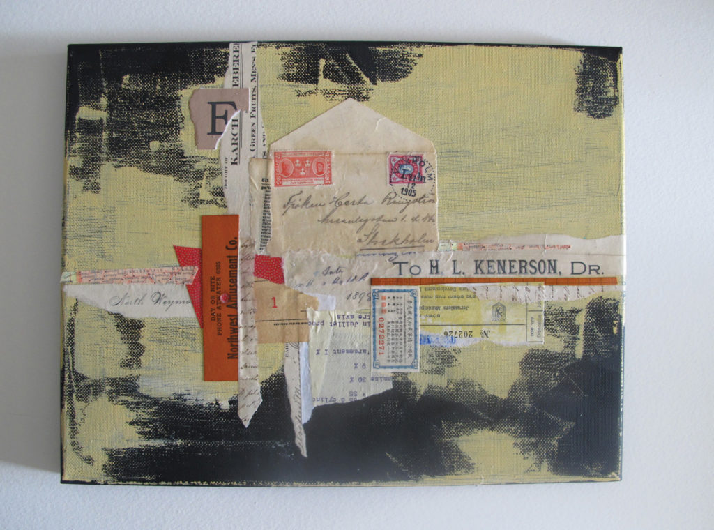
Pro tip: When adhering an envelope to a composition as I did, consider cutting away the back side of the envelope for better adhesion and less bulk.
6. Add More Paint
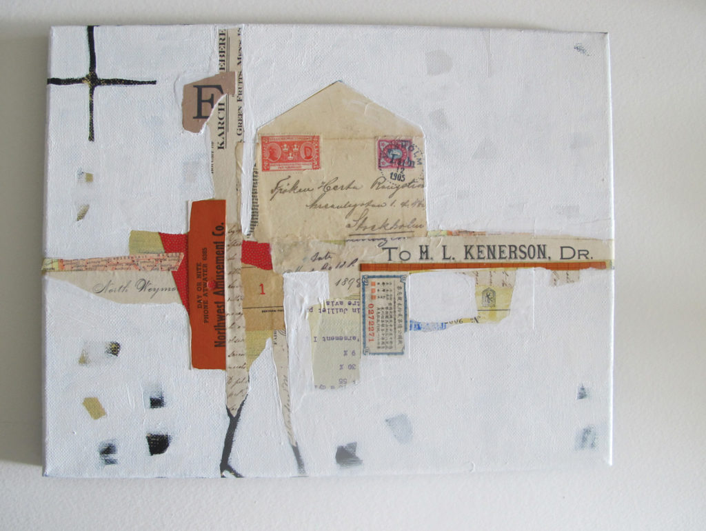
Once you have the elements in place, it’s time to paint. Looking at the composition at this stage, I could see I needed to do some editing. I knew I wanted the aged aspects of the ephemera to stand out, so I chose to use Titanium White acrylic paint. With my brush, I applied the paint and edited out some of the edges and details of the collaged elements. I also left patches where the Titan Buff and Naples Yellow Hue showed through, as well as bits of the black background. I wanted the background clean but not too clean, empty but not barren. Editing helps you hone in on what you want your viewer to see. You may need two coats of white paint to cover the dark areas and get good coverage.
7. Make Your Mark(s)
Create some emphasis in several areas using pencil. I thought the rawness of the pencil marks would play off the vintage elements in the composition. With the pencil, I emphasized some lines of the composition and made marks on and elongated other elements. Usually, I start with strengthening or lengthening both a vertical and a horizontal line in the composition. After that, I use my artistic instinct to select other areas to emphasize or extend. I think the hand-drawn details add to the overall complexity of the composition.
8. (Optional Step) Level Your Surface
Add a faux-wax layer using the Gel Topcoat. I use this to de-emphasize various levels on the surface. Some of my collage pieces were fairly thick. Using a coat or two of thicker medium, such as the Gel Topcoat or a heavy gel medium, as a final coat serves to level the surface visually. Gel Topcoat is one of my favorite mediums. It is thick and juicy, spreads easily and the UV protection is a great addition when working with old papers. Spread the gel with a wide blade for an even surface, and allow several hours to dry.
The Power of ‘What If’
Rauschenberg’s ability to look at the possibilities inherent in materials we see every day is such a good lesson for those working in mixed media. I encourage you to always ask “what if” in your art practice. What if I used something upside-down or inside out? What if I substitute a different yellow? And, what if I just gesso over it? Let innovation be your companion as you pursue your artistic explorations.
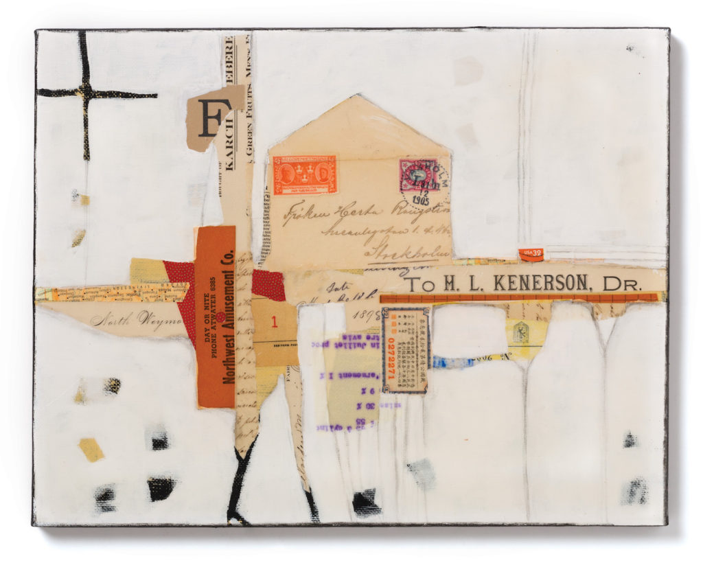
*This art and article by Chris Cozen first appeared in our sister publication, Cloth Paper Scissors.
About Chris Cozen
Chris Cozen is an educator and self-taught mixed-media artist as well as a Golden Artist Colors Golden artist educator. Chris has authored several books, including Acrylic Color Explorations: Painting Techniques for Expressing Your Artistic Voice. She has also hosted numerous instructional videos on acrylic techniques with Artists Network TV. Want more instruction from Chris Cozen? Explore the colorful world of acrylic painting and learn expert techniques along the way with Cozen’s Acrylic Color Essentials video workshop collection, which also includes instant access to her ebook, Acrylic Color Explorations. Enjoy!
This Collage tutorial was very inspiring. I found it very helpful and will try doing a Collage for myself. Thank you for posting it.